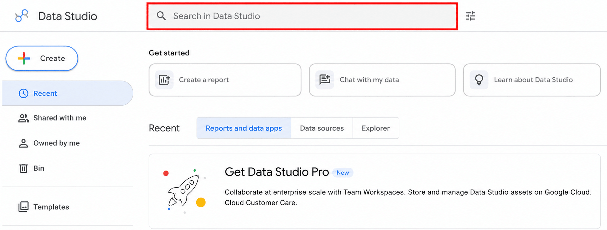
What is Data Studio: A Comprehensive Overview

Data Studio redefines digital marketing analytics, replacing Google Data Studio to meet complex reporting needs. Its user-friendly interface and advanced visualisation tools simplify data analysis, allowing marketers to focus on insights rather than data management.
Confronted with often overwhelming analytics data, marketers have struggled to present clear, understandable reports, especially to SMB clients. Data Studio transforms this data into concise, visually appealing reports, making analytics accessible for both marketers and their clients/bosses.
What happened to Looker Studio?
Google Data Studio, launched in 2016, was widely used by marketers for their data visualisation needs. In 2022, Google rebranded it as Looker Studio, following its acquisition of the Looker platform in 2020. This rebranding was part of a broader effort to unify Google’s business intelligence tools and retain the core features of Data Studio while refreshing its name and logo.
Looker Studio then rebranded again back to Data Studio on April 16th 2026. We really wish Google would stop changing the names of their products.
What is Data Studio?
Data Studio converts complex data sets into user-friendly reports. It allows the integration of data from multiple sources into one platform. Users can enhance their reports with various tools like graphics, tables, and charts. Customisation options such as text, colours, and branding elements like personalized logos are also available.
The platform supports over 800 data sources, including third-party services like Facebook and LinkedIn Ads. This broad compatibility ensures comprehensive reporting. Additionally, Data Studio’s reports are dynamic, automatically updating with new data from these sources.
Data Studio’s sharing features are similar to Google Docs and Sheets. Users can easily share reports with team members or clients. They can control access levels, allowing others to view or edit the reports, ensuring both collaboration and data security.
Getting started with Google Data Studio
Starting with Google Data Studio is straightforward and user-friendly. It’s designed for both beginners and experienced users in data visualisation. You only need your existing Google account to use Data Studio’s free version. Let’s explore the fundamentals of Data Studio.
Registering for Data Studio
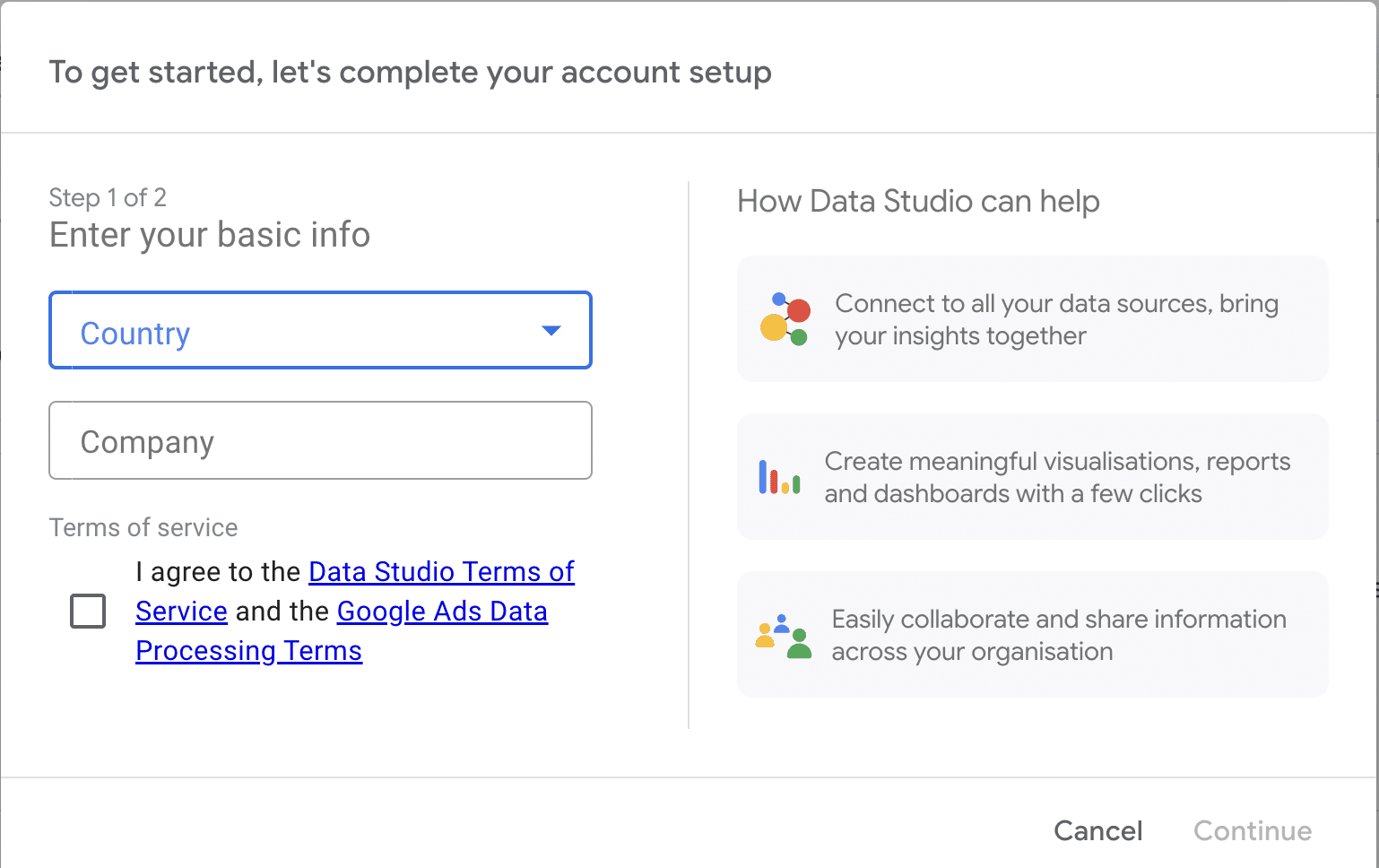
To start using Data Studio, head to Google Data Studio’s website and click on the “Get started” button on the page.
If it’s your first time, It will prompt you to answer a few basic questions, such as your country and company name. You’ll also have the option to opt-in for email updates.
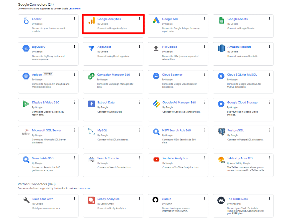
Once your initial setup is complete, the next step involves choosing a data source, commonly called a “connector.” For many, Google Analytics is a primary choice as the connector. Cause GA4 & Data Studio can work hand in hand to find actionable insights. You’ll find an option to select from various Google Connectors.
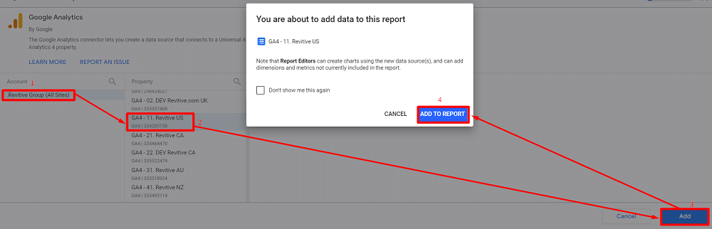
After selecting your connector, such as Google Analytics, you will need to authorise and connect it.
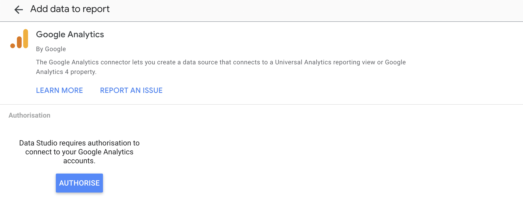
This process is straightforward: select your desired GA account, Then click on the “Add” button from the bottom-right of your screen, and click the “Add to Report” button to load the data of your selected GA account.
Finally, you’ll be presented with a blank report canvas. But don’t worry; Data Studio also provides a range of sample reports and templates. These templates are incredibly useful for understanding the types of data you can incorporate into your custom reports.
About connectors, data sources, and credentials
In Data Studio, you can connect to data through the following components:
- Connectors.
- Data sources.
- Credentials.
Connectors link Data Studio to your desired data source, like Google Analytics or Google Ads. These connectors create data sources in Data Studio. A data source is a connection to a specific data set, such as a Google Sheet. It lets you share insights securely.
Data Studio has two kinds of data sources: embedded and reusable. Embedded data sources are part of a report and can be edited. They are shared with the report. Reusable data sources are made from the homepage and can be used in many reports. They help keep data consistent across reports.
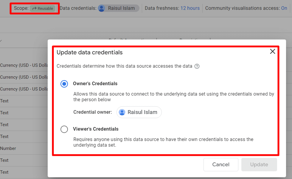
Credentials control who can see the data in a data source. ‘Owner’s credentials‘ use the owner’s access to data. ‘Viewer’s credentials’ require each person to have their access. Be careful when sharing reports with ‘Owner’s credentials‘ to ensure you trust the people you share with.
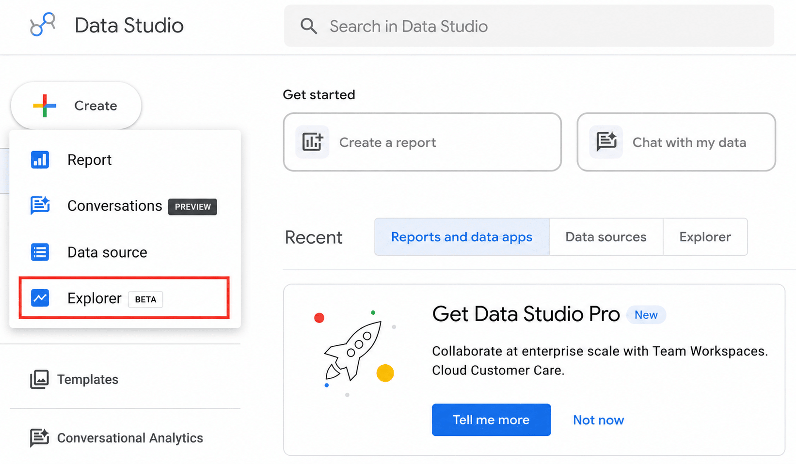
Data Studio’s homepage has three key areas: ‘Reports,’ ‘Data Sources,’ and ‘Explorer.’ You can create and edit your data reports in the Reports section. This area is dedicated to creating and customising your data visualisations.
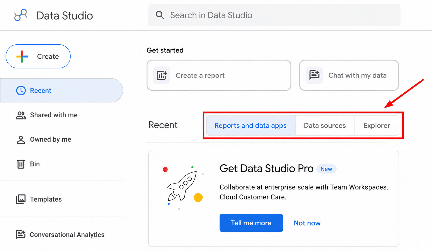
‘Data Sources‘ is where you connect to different data, like Google Analytics, Google Ads, Google Sheets, YouTube & other sources. For example, linking YouTube lets you track and report on video views. Once connected, these sources are listed here for easy use.
The ‘Explorer‘ section is for working with data in a temporary space. Here, you can try out different visualisations and filters. But remember, these are not saved unless you choose to. These files are private and cannot be shared directly. But you can export data from here & share it that way.
The Data Studio layout is similar to Google Drive, so it feels familiar. If you need to, just click on the logo to return to the start page.
Creating your first report in Data Studio
Creating your first report in Data Studio is an exciting step towards better data visualisation and analysis. To ensure a smooth process and effective results, you should keep the following actions in mind:
- Selecting a template or dashboard.
- Linking data sources
- Picking important metrics
- Editing a report
- Adding report filters
Selecting from Data Studio Templates
When starting with Data Studio, your first step is selecting a template. After logging in with your Google account, which should be the same one used for your Google Analytics or Google Ads account, explore Data Studio’s range of templates.
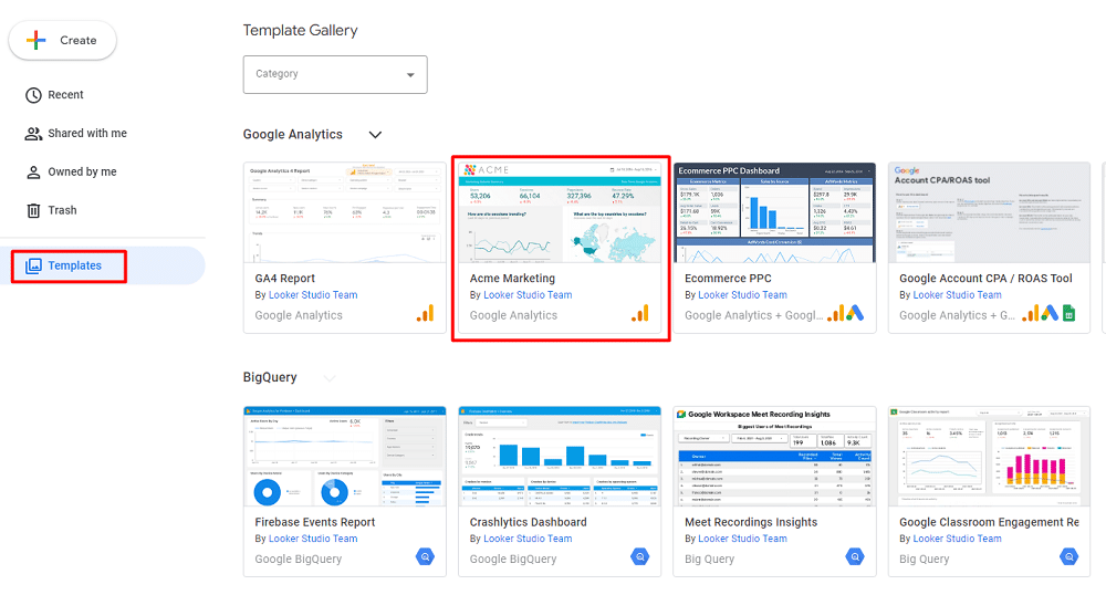
For example, you can choose the “Acme Marketing” template. In the next window, you will be presented with two options, “Use my own data” or “Edit & share“.
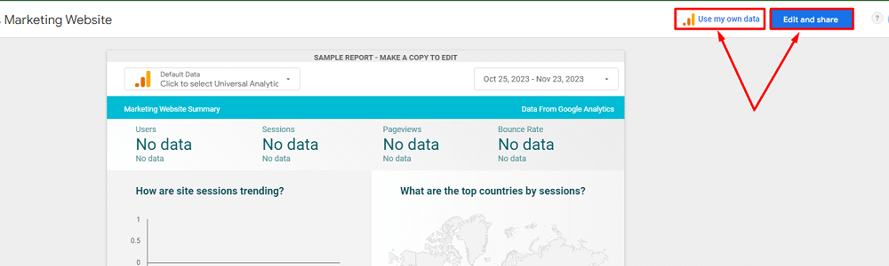
You can choose the “Use my own data” option to connect the required data sources for the template before making any changes to the report. If you want to add the data sources later & want to customise the template, then select “Edit & share“.
Data Studio’s dashboard templates are designed for customisation. You can adjust elements and fonts to suit your specific reporting style. Remember, you’re not limited to a single page – you can add multiple pages to your report. This flexibility allows you to tailor the report to each client’s requirements.
Consider your audience when choosing and customising a dashboard. The information and style vary depending on who is viewing it. For instance, a report for a CMO might focus on broader marketing channels and goals. In contrast, a Product Marketing Manager might need more detailed data.
Connecting a data source
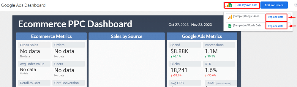
If you have selected “Use my own data” while choosing the template. Connecting the required data sources for that temple is pretty straightforward. Just click “Replace data” from the dropdown.
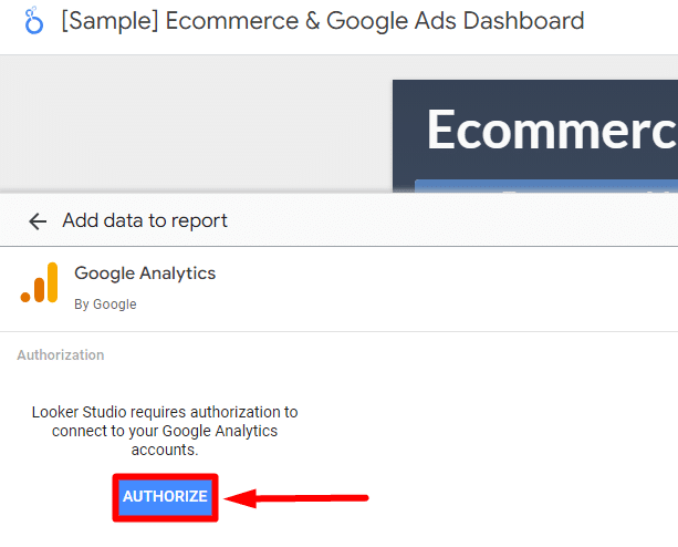
Then, click “Authorize” from the next window to allow access to Google Analytics, Google ads, GSC or other services associated with your Google account.
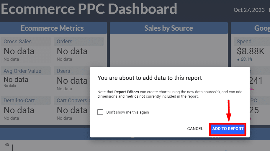
If you’ve selected “Edit & share, ” you’ll see a pop-up. Click “Add to report” from that.
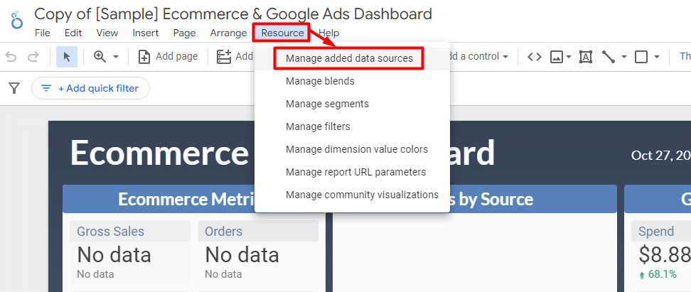
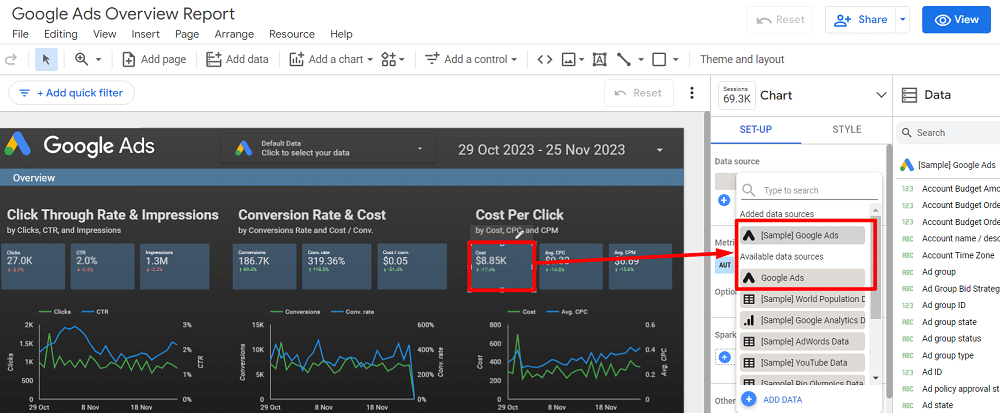
Now that you’re in the Data Studio’s report dashboard. Head to the top navigation, click ‘Resource‘, and then ‘Manage added data sources‘.
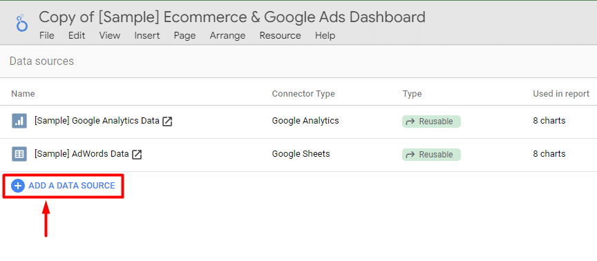
Now, you can add a new data source by clicking ‘+ Add A Data Source‘.
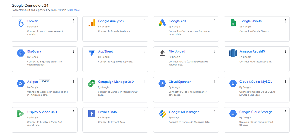
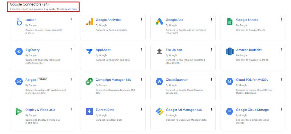
Data Studio offers a variety of connectors, including 24 Google-owned options like Google Analytics, Google Ads, and Google Sheets.
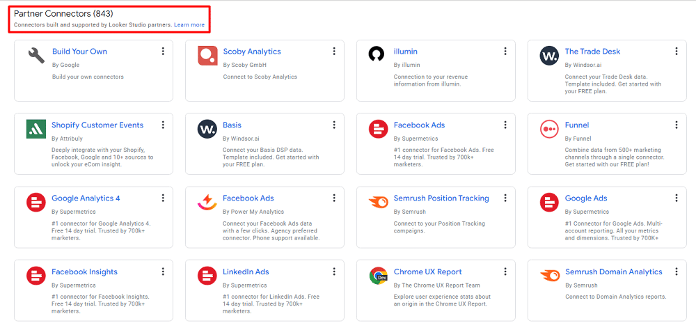
But, your data might not be limited to Google products. Data Studio also allows connections to over 843 different data sources from partner connectors. This extensive range includes social media platforms, third-party tools, CRM systems, and more.
When integrating these data sources, especially third-party ones, be aware of potential additional costs and the possibility of slower report performance. You’ll also need to authorise the connection between Data Studio and your data sources to ensure accurate and seamless data syncing.
Picking important metrics
Metrics are a critical aspect of any report, especially in Data Studio.
It’s crucial to avoid overwhelming clients with too much information. While Data Studio allows for ample customisation, it’s best to show only the metrics that are most relevant to your client’s needs. Overstuffing reports with every possible metric can lead to confusion rather than clarity.
Focus on metrics that align with your client’s objectives. For example, if they’re concerned about return on advertising spend (ROAS), include relevant metrics like spend and revenue. Or, if they’re focused on brand awareness, opt for pre-click metrics such as impressions, clicks, CTR, and view rate.
By tailoring the metrics to the client’s goals, you demonstrate attentiveness and understanding, creating a beneficial situation for both parties.
How to edit a report
It’s time to personalise your report after connecting your data sources in Data Studio. Let’s use a Google Ads template for our example. First, check that you’re in “Edit” mode, not “View,” to begin editing.
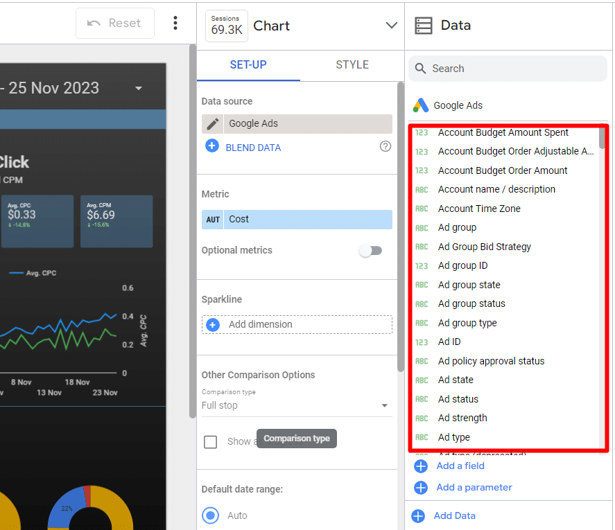
To customise your report, use the data field sets available on the right side of the screen. If you start with a template, the initial step involves changing the data source for each chart to your preference.
Once that is done, you can tailor the visualisations using different data fields from your chosen data source.
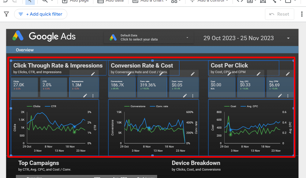
Customisation in Data Studio goes beyond just data. You can modify charts and tables and adjust the report’s overall appearance, including:
- Change font styles and the background colour for a custom look.
- Alter the colours of comparison metrics for better clarity and visual appeal.
- Adjust text padding for left, centre, or proper alignment to improve layout.
A helpful tip: Select them together to make uniform changes to multiple scorecards or charts. This way, any style changes you make will simultaneously apply to all your selected items.
Adding report filters
Adding filters to your report in Data Studio is a great way to group different visualisations efficiently. For instance, you can add a ‘Date range control‘ to the report level to update all tables and charts when you change the date range.
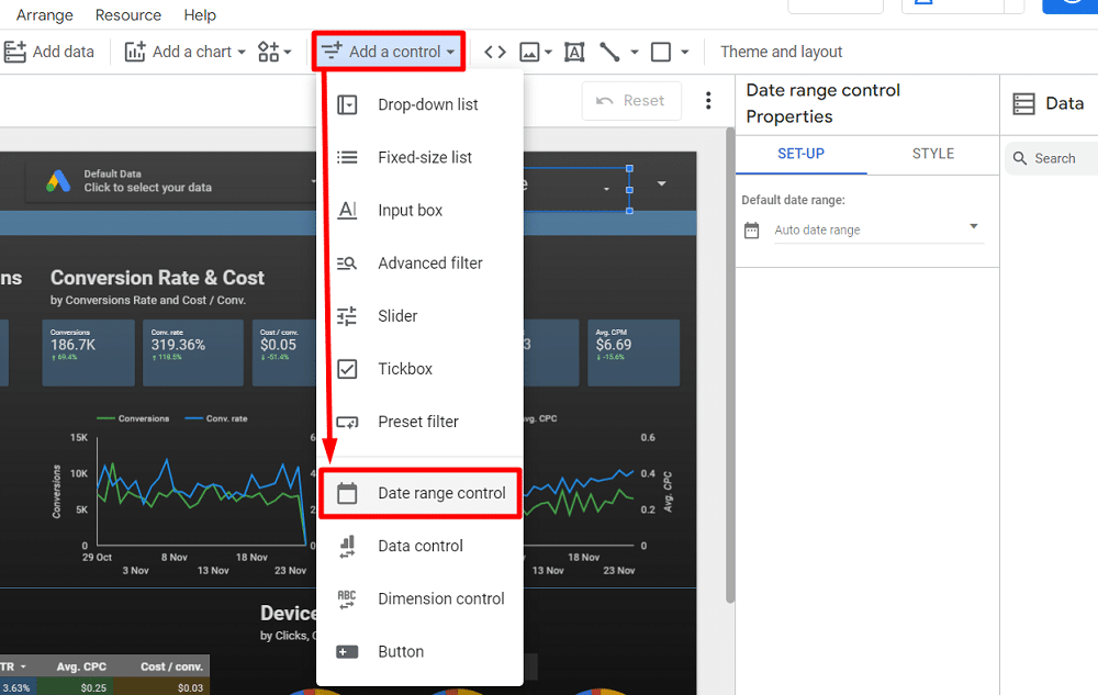
This setting ensures that changing the date range will update all charts across the entire report if your report has multiple pages.
Suppose you want to analyse performance by campaign type. Data Studio makes this easy with its filtering options. Go to the toolbar, select ‘Add a control,’ then choose ‘Drop-down list,’ and set the ‘Campaign type‘ as your filter field.
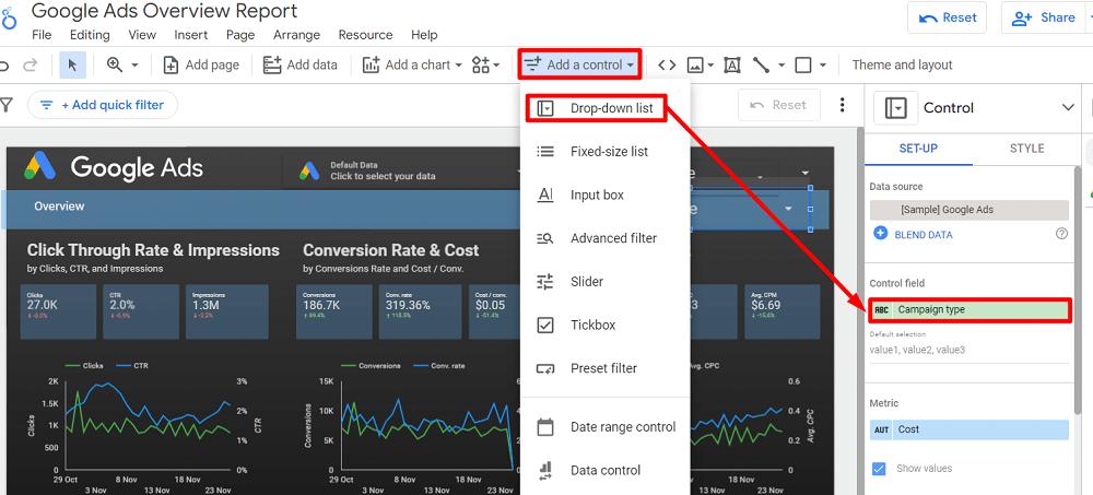
Doing this will enable you to drill down into the data on that particular page, filtered by campaign type, like comparing Search and YouTube performances.
Filters in Data Studio are added at the page level by default. However, if you need a filter to apply across the entire report (report-level), right-click on the filter and select ‘Make report-level.’
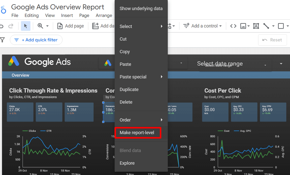
This action will ensure that the chosen filter appears on every page of your report, allowing for consistent data analysis across the entire document.
Sharing Data Studio reports
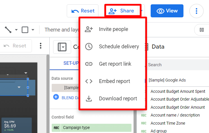
Once you finish a report, you can share it with the interested party. Sharing your Data Studio report can be done in various ways, each suited to different sharing needs:
- Invite People: Directly invite others to view or edit the report via their Google account email.
- Schedule Email Delivery: Set up automated report delivery to specified recipients.
- Get Report Link: Generate a link to share your report.
- Embed Report: Embed the report into a website or intranet.
- Download Report: Download the report for offline access or distribution.
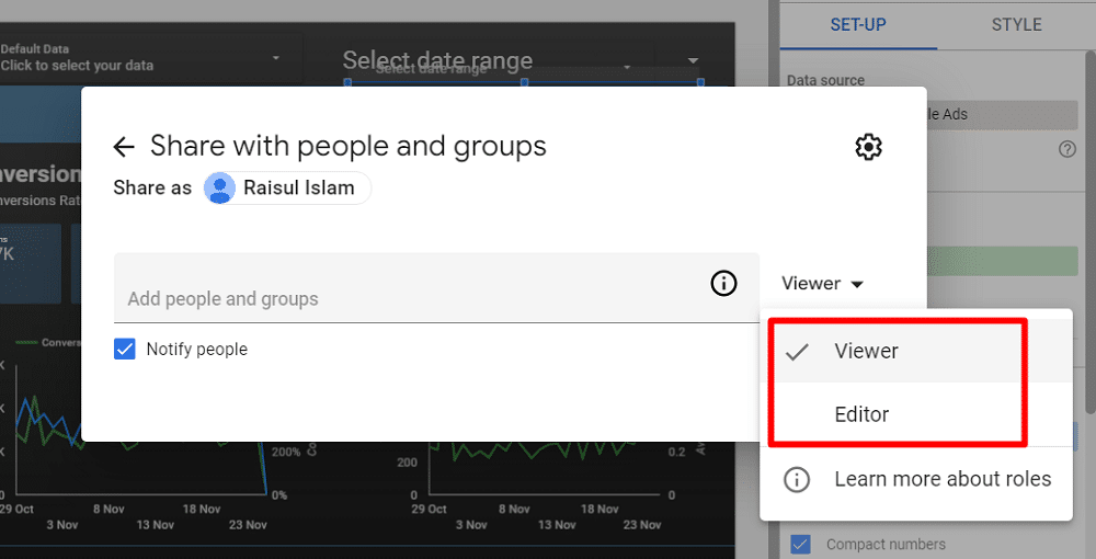
When inviting people to access your report, managing the share settings to give proper access accurately is crucial. You can add someone by their Google account email as either a ‘Viewer’ or an ‘Editor.’
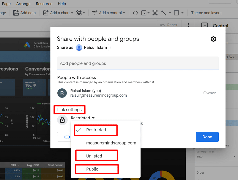
Data Studio also offers “Link setting” options to control access to a report:
- Restricted: Limits access to only those you’ve shared the report with.
- Unlisted: Allows anyone with the link to view or edit, so use this setting cautiously.
- Public: Makes your report findable and viewable (or editable) by anyone with the link.
To safeguard your data further, Data Studio has additional sharing restrictions. In the share settings, select the ‘gear’ icon to access these options:
- Prevent editors from changing access and adding new people.
- Disable downloading, printing, and copying for viewers.
- Disable viewers from viewing and creating alerts
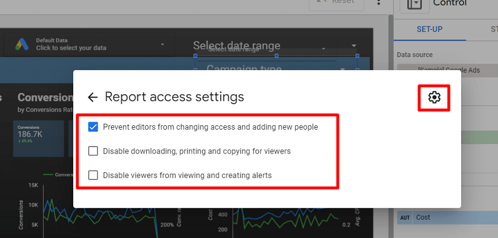
It’s often recommended to choose the first option, preventing editors from modifying access or adding new people. This helps maintain control over the report’s settings and the integrity of any changes made.
Managing Google Data Studio reports
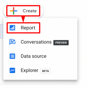
Data Studio is excellent for its reports. To make a new report, click ‘+Create‘ in the top left corner of the home screen and select ‘Report.’
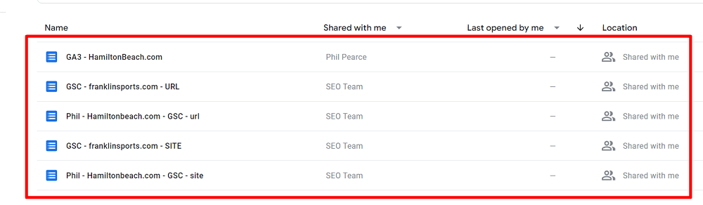
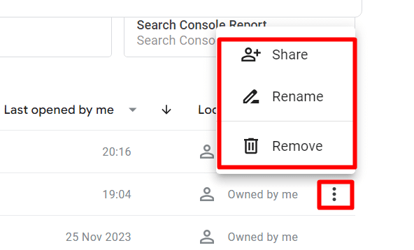
Finding the one you need can be tricky when you have many reports. Use the search feature to find your desired one if you’re not sure of its exact name.
If you’ve saved reports, managing them is easy. Just click on the three-dot menu of a report to share, rename, or delete it. This helps keep your reports organised.
When giving reports to clients, it’s good to avoid giving too much information. Add a section in the report explaining how to read and use it. You can sort reports in different ways, like by channel, to show clearly how each channel is doing. This helps clients understand and get the most out of the report.
Exploring Google’s Data Studio charts
Charts play a pivotal role in enhancing Data Studio reports. They are fundamental tools for visualising data and turning complex information into accessible and insightful visuals.
Available chart types in Google Data Studio
Data Studio offers a wide variety of charts and graphs to help you visualise your data, including:
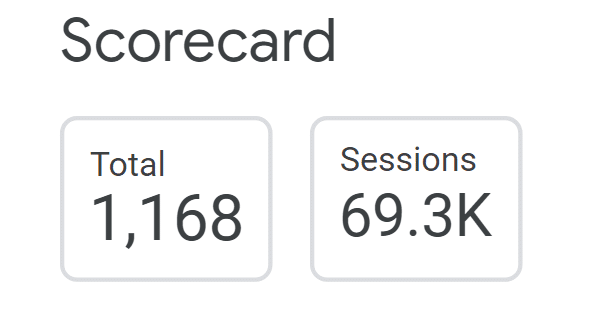
- Scorecard: A scorecard is a simple way to display a summary of a single metric. For example, you could use a scorecard to track your website traffic, sales revenue, or sessions.

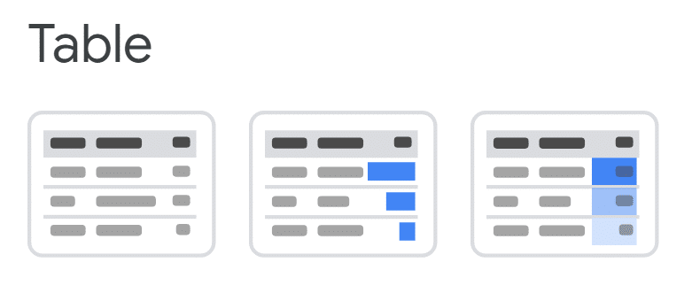
- Table: It is an excellent way to display a large amount of data, especially if you want to be able to sort and filter the data. For example, you could use a table to display your customers’ list, contact information, and purchase history.

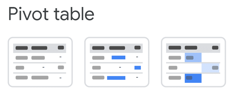
- Pivot table: A pivot table is a powerful tool for summarising and analysing your data. For example, you could use a pivot table to see how your sales revenue has changed or to identify which products are the most popular with your customers.

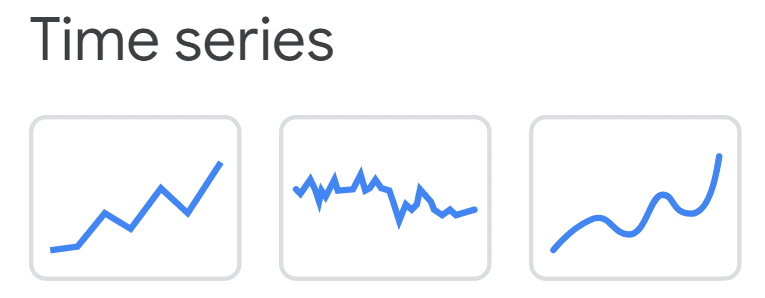
- Time series: This chart is an excellent way to visualise data that changes over time, such as sales revenue, website traffic, or stock prices.

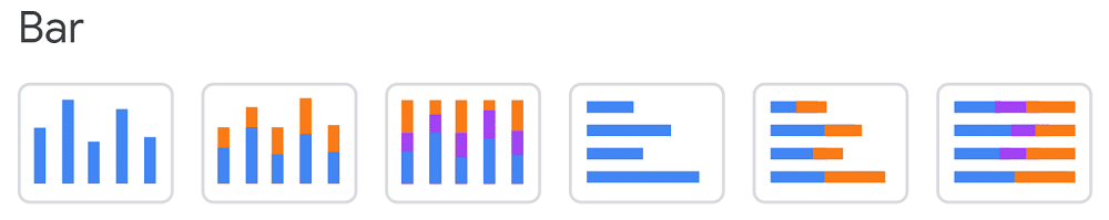
- Bar and column: A bar chart or column chart is an excellent way to compare two or more categories of data. For example, you could use a bar chart to compare your sales revenue by region or website traffic by browser.

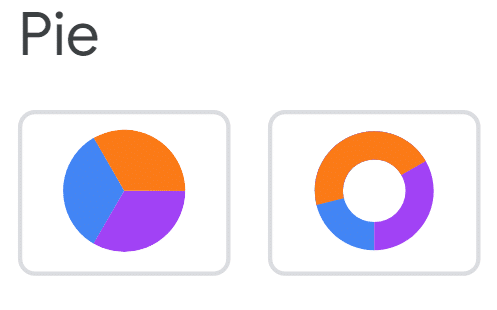
- Pie: This chart is an excellent way to show the proportions of a whole. For example, you could use a pie chart to show the percentage of your customers who live in each country or the percentage of your sales revenue from each product category.

- Combo: A combo chart is a chart that combines two or more types of charts. For example, you could use a combo chart to show both a time series chart and a bar chart to see the trends in your data and the individual values.
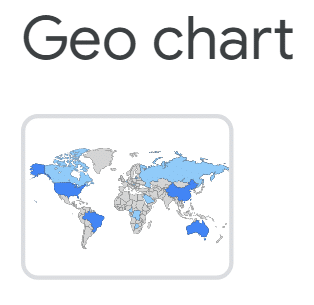
- Geo: It is a great way to visualise geographic data, such as sales revenue by country or customer locations. For example, you could use a geo chart to show where your customers are located or how your sales revenue is distributed by country.

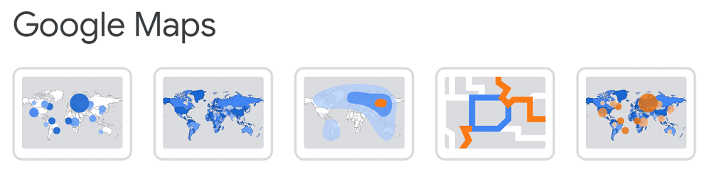
- Google Maps: You can also use Google Maps to visualise your data on a map. For example, you could use Google Maps to show your customers’ locations or see how your sales revenue is distributed by region.

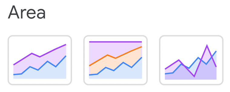
- Area: An area chart is a great way to visualise data that changes over time and shows a metric’s cumulative value. For example, you can use an area chart to show how your sales revenue has grown over time or the cumulative number of website visitors.

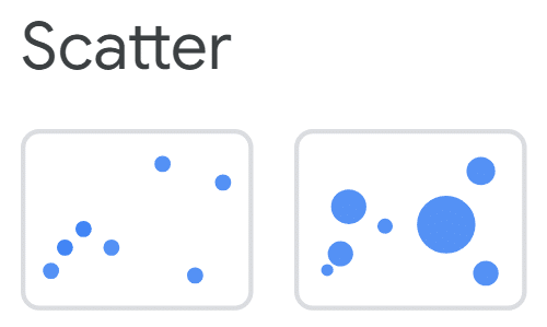
- Scatter: A scatter chart is an excellent way to show the relationship between two variables. For example, you could use a scatter chart to establish the connection between your sales revenue and your advertising spending.

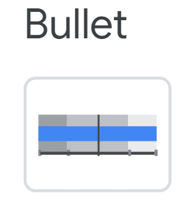
- Bullet: A bullet chart is a great way to track the progress of a given metric towards a range of goals. For example, you could use a bullet chart to track your sales revenue against a target goal or your website traffic against a benchmark.

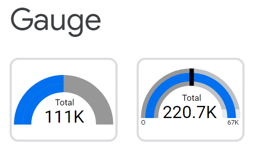
- Gauge: It is a good way to see how well a given metric performs against a target goal. For example, you could use a gauge to track your customer satisfaction score or website uptime.

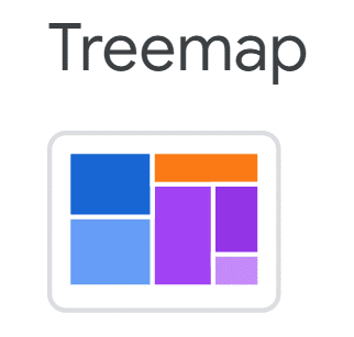
- Treemap: A tree map is an excellent way to visualise hierarchical data, such as the organisation of your company or the categories of products you sell. For example, you could use a tree map to show each department’s sales revenue or the number of products in each category.

- Sankey: A Sankey chart is a great way to visualise the data flow from one set of values to another. For example, you could use a Sankey chart to show how customers move through your sales funnel or how traffic flows through your website.


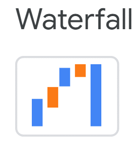
- Waterfall: This chart helps you visualise how a sequence of positive and negative values adds up to a total. These charts are often used for financial data to show how various profits and losses make up a total.
In addition to these built-in charts, you can also create custom charts using the Data Studio Community Viz extension. This extension allows you to create charts using HTML, CSS, and JavaScript.
Conclusion
In conclusion, Data Studio offers a powerful and user-friendly platform for data visualisation and reporting. With its seamless integration with various data sources and extensive charting options, Data Studio allows users to create insightful and customisable reports. Whether you are a beginner or an advanced user, Data Studio provides the tools and functionalities to meet your data analytics needs. So, start exploring Data Studio today and unlock the full potential of your data.
Data Studio FAQ
What does Data Studio do?
Data Studio is a versatile and free data visualisation tool that transforms your data into easy-to-understand, shareable dashboards and reports. It offers real-time, interactive dashboards and connects effortlessly with many data sources like Google Analytics and Salesforce.
What is Data Studio used for?
Data Studio is a business intelligence (BI) platform used for data exploration, analysis, and visualisation. It connects to multiple data sources and uses LookML, a unique data modelling language, to simplify report and dashboard creation without requiring SQL expertise.
Is Data Studio similar to Tableau?
Tableau and Data Studio are leading BI tools, each with its strengths. Data Studio, known for its simplicity, uses features like Data Studio Blocks for easy analytics management. This makes it ideal for users seeking an intuitive system. Conversely, Tableau is renowned for its extensive data analytics and management capabilities, perfect for those needing a more complex, detail-oriented tool.
While Data Studio is exclusively cloud-based, Tableau offers both cloud-based and on-premises options. Pricing for Data Studio is based on data volume and users, whereas Tableau’s pricing depends on the number of users.
Is Data Studio easy to learn?
Data Studio’s learnability depends on your SQL and data modelling experience. Its Data Studi Modeling Language (LookML) is SQL-based, making it approachable for those familiar with SQL. The user-friendly interface aids in easy dashboard creation. However, beginners in SQL may find LookML challenging due to its reliance on understanding complex data structures.