The PICA Protocol™ Prescription for Healthy, Actionable Data Storytelling

By now, we all know and love Google Analytics (GA). The tool is packed with actionable insights into our data. But sometimes, you’ll need to convey this information in actionable data storytelling.
What you want is an alert audience. But too often, what you get is people nodding off and falling asleep. Are you feeling this frustration?
Today, we’ll show how strong actionable storytelling, helps you to gain an engaged and captivated audience.
This is a write-up of the talk that Lea Pica gave at GA4ward. Here you can find access to the slides and a recording of the webinar too.
What makes a great story?
Think about the stories that stick in your mind, what do you like about them? The hero’s journey, memorable characters, gripping plots? Obviously, there’s no single right answer here.
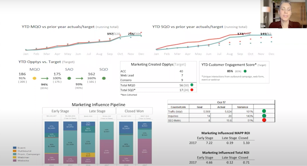
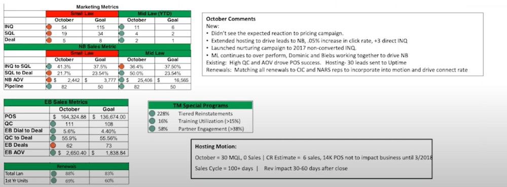
Now, bearing the above factors in mind, what do you associate with this image? Confusion, a headache, maybe even chaos?
But why are the emotions so different? Well, put simply, the image above isn’t telling a story. This is one of the reasons that people struggle with their GA data. If data isn’t part of a story, we can’t see how it fits into the wider picture.
If you tried to present the above image to executives, you’d probably see a lot of confused faces. Far from thinking about your data, people are more likely to be thinking about their dinner. Let’s be honest, if all stories were told like this, we wouldn’t see many blockbuster hits.
Think again about the crucial aspects of every strong story. There’s no reason why we can’t apply these elements to our data storytelling.
Presentation zombification
Are you finding people are leaving presentations asleep, bored, and perhaps even drooling? Well, this isn’t a problem faced only by you. In fact, there is a global issue facing boardrooms: Presentation Zombification. If you think this isn’t a big deal, you might want to think again.
The fact is, this condition is expensive. A recent Doodle study found that a whopping $541,000,000,000 is wasted annually during ineffective business meetings. This study was only conducted in two countries, the US and UK!
Of course, this isn’t just expensive for businesses. Presentation Zombification is also emotionally taxing for you the practitioner. You spend hours sifting through and compiling data, only to be met with blank faces.
Data storytelling
But how do you avoid these unwanted situations? Well, it all boils down to your perspective or data storytelling.
A well-told data story can help stakeholders in the following ways:
- Answers their burning questions.
- Informs important business decisions.
- Inspires new ideas.
- Galvinises your audience into action.
Ultimately, the numbers that sit in your excel spreadsheets create data. But your stories about the numbers are what create insights.
The prescription
You now know that storytelling is the cure to presentation zombification. But how do you present data in a way that tells a story? The answer is The PICA Protocol™. This is a practical prescription for delivering data stories that inform decisions, spark ideas, inspire action, and make practitioners indispensable resources to their organizations and clients.
We’ll look at the PICA Protocol letter by letter.
P – Purpose
Remember when you’re carrying out a presentation, you aren’t just addressing one need. Each attendee requires something different. One stakeholder might be interested in improving email marketing performance. Another might want to know whether you’re hitting your regional sales quota for the quarter.
The one question that you want to avoid is ‘what am I doing here?’. Being realistic, we’ve all had this experience at least once.
The key to avoiding this is by establishing a clear purpose for everything that you are talking about.
Are you asking important questions?
Too many presenters pile on information hoping for the best. This will never get you very far. An audience will find it hard to connect and absorb what you’re saying.
You need to ask the following set of questions about each piece of information in your presentation.
- Why do I exist? – Is data an integral part of the decision-making process? If information doesn’t inform, lose it.
- What need are you meeting? – Remember, whilst it might not seem like it all the time, you are presenting to humans. Your audience has needs and desires. For example, an attendee might be asking ‘how can I meet my bonus criteria?’. Each piece of data needs to meet the needs of your audience.
- What problem are you solving? – What is the monkey on your audience’s back? Let’s imagine there’s an issue with the website. How can data help them overcome their problems?
- What choices are you informing? – What decisions are at hand and how does your data link up to them?
- How are you making my stakeholders’ lives better? – Remember, your stakeholders are busy and overwhelmed. They have a finite set of resources (time, personnel, money). You’re offering a strategic recommendation using your insights. But you’re also competing for resources.
Choose the most effective visualization
How do you pick the best visualization to display your data? The best place to start is by having a conversation based on the questions listed above. But don’t just have the conversation on your own. Actually speak with your stakeholder – they won’t bite! Actually, they’re more likely to be pleased that you’re invested in their needs.
As the conversation unfolds, listen out for keywords. Even if they don’t know exactly what they want, a stakeholder will give clues in a conversation. Let’s imagine that a stakeholder says they want to know how their marketing channels are performing. On further questioning, they reveal that they want to know how customers convert.
From this conversation, you’ve gained two keywords ‘marketing channels’ and ‘conversions’. Marketing channels are a list of categories that we can compare using a particular metric. Conversions are a measure or a metric that can be used to compare a list of categories.
This presents a clear question: ‘what campaign channels generate the highest conversions?’.
Always choose clarity
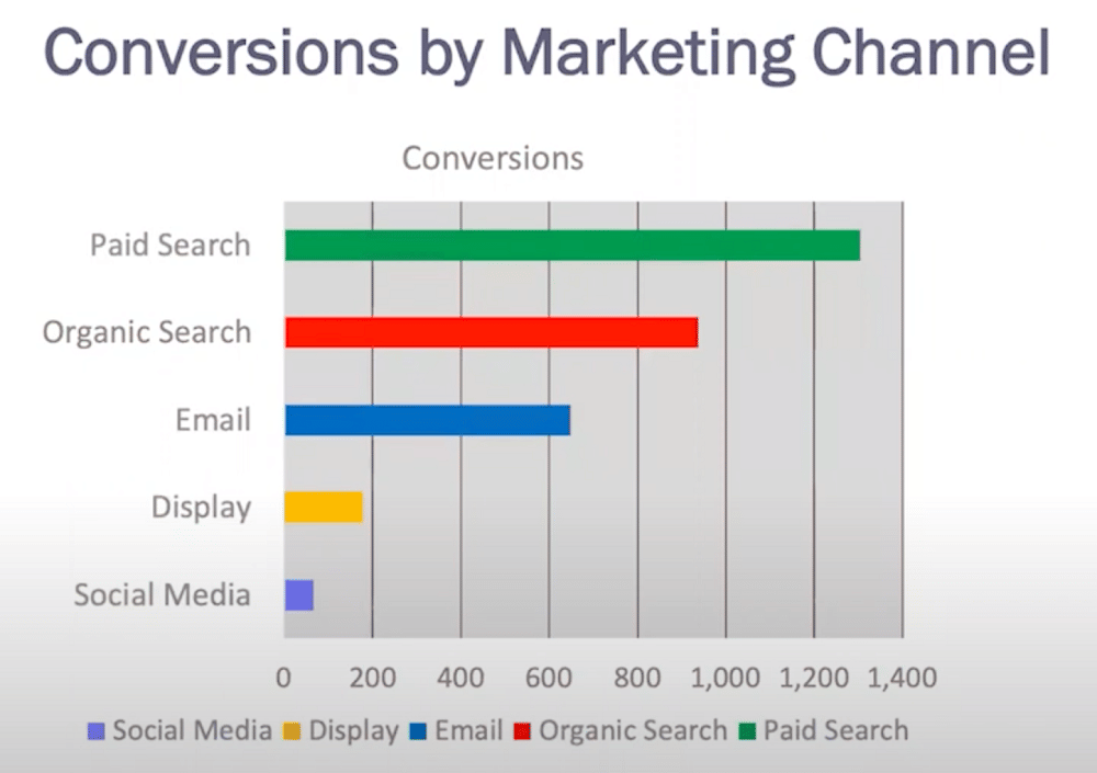
So, to answer the question ‘what’s the best visualization to display my data?’. In this scenario, we need a comparison of marketing channels by conversion volume. In other words, a horizontal categorical bar chart. Admittedly, not the most exciting option.
But remember, the fanciness of your visualization isn’t what’s important. Clarity is the most significant aspect here. That’s why, when building your chart, sort by priority (as seen above). That way, when viewers read the chart they instantly know how it should be read.
Going back to the question ‘what campaign channels generate the highest conversions?’. Our visualization presents a clear answer: paid search.
An important point: your visualization tool doesn’t know what your best chart choice is. This is a judgment call that you need to make as a practitioner of data communication. In other words, you need to learn about different chart types and the best times to use them.
I – Insight
Insight is a term that data practitioners will hear often. But what does it actually mean? Here’s a simple definition:
‘The capacity to gain a new, accurate and intuitive understanding of a person or thing.’
In other words, as a data practitioner, you’re trying to create a ‘eureka’ moment for your audience. Insights are all about providing knowledge and something new.
Provide a narrative arc
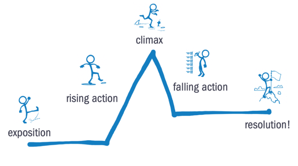
The missing piece from most presentations is a clear narrative arc. Without this, your audience won’t gain any insights. Let’s imagine a typical data story.
- We begin with our character (in this instance the stakeholder). We’re painting a backdrop and setting a scene for the protagonist. But now we need something to happen to kick the story off.
- For this, we need a ‘rising action’. This could be an unexpected event in our data causing conflict for our character. A conflict could mean a problem, there is something standing in the way of what the character wants. Or, conversely, an opportunity. Something that the character wants but can’t obtain because of an obstacle.
- The tension builds to the climax. The audience can’t see what’s coming next, how can things get worse? Most importantly, what’s at stake if action doesn’t occur?
- Now you need to bring the tension down. This is the ‘falling action’. You’ll provide recommendations and a plan of strategies. You’ll show how a challenge will be overcome.
- Finally you come to a resolution. Your audience is wiser than before and knows how to move forward.
Anatomy of a persuasive data visualization
So, you have your data insights. Now present them in a logical and persuasive way. Use the example below as a blueprint for your field:
Title: 12%
Subtitle: 8%.
Visualization field: 75%.
Sources: 5%
Let’s focus on the title. This is the most important visual real estate on your slide. In western culture, it’s the first place our eyes go. We then consume the field in a ‘Z’ pattern. We consider this when constructing our websites. But the same thought isn’t often given for presentations.
More commonly, we use that space to make a description of what the chart on a slide is. But what if, instead of this approach, we provide an observation of what a chart actually means?
The description can become a subtitle. We can then use this vital space to communicate an observation that pushes the story forward.
Let’s look at the two examples of titles: (A) ‘Conversions by marketing channel’, and (B) ‘Paid & organic search generate the highest volumes of conversions.’ Title (A) might tell us what is going on in a chart, but it doesn’t draw the reader into the story. Title (B) provides an observation, bringing the reader into the narrative.
No matter how your audience has interpreted the title, the message you are trying to convey comes across.
C – Context
It’s time to go deeper into the data. You don’t want to be taking the first insights that jump out at you at face value. Ask yourself, ‘Do I have all the information at my disposal to tell a complete picture? Or am I showing all the information to make a sound and informed decision?’.
With the help of some visual context tools, you can ensure that you’re answering ‘yes’ to both questions. Try to make use of the following tools.
- Performance targets/benchmarks – these create a sense of competitiveness. You should always be shooting toward something.
- Prior time period comparison – What does this performance mean in the context of yesterday?
- Segmentation – How can we look at data from different angles and find the deeper nuggets?
- Additional measures – What other pieces of information can help us to flesh out our story?
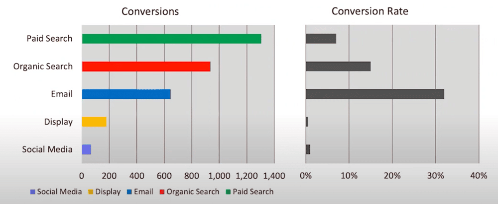
For example, as a data analyst, you might be asking ‘how does conversion rate affect my story?’. You might then add a second measurement using a side-by-side chart. As shown above, you add a duplicated chart but instead of showing conversions, we show conversion rates.
This brings a new dimension to our insights. Despite paid search creating the highest number of conversions, it delivers a low conversion rate. Instead, email provides a medium number of conversions, but the highest conversion rate.
Going deeper with context
There are lots of ways to go deeper with context. You can ask:
- Does performance vary by region?
- Does looking at mobile platforms spread more light?
- What tests were associated with each channel?
- What other sources of data can we explore?
Don’t get caught in the analysis paralysis rabbit hole that many practitioners know too well. Always make sure you have a deep enough story to make a solid decision for your stakeholder.
A – Aesthetics
Contrary to popular opinion aesthetics isn’t about making charts look flashy and exciting. It’s about using principles of visual queues that allow for the efficient and accurate interpretation of data.
There are two main steps to this process: cutting the clutter and intentional emphasis.
It’s fair to say that image above didn’t get the memo on either of these points. There’s a lot going on and a reader doesn’t know where to look. In other words, we’re receiving something called cognitive overload. This is defined as ‘the total amount of mental effort being used in the working memory’.
The working memory has a finite capacity, it can only take on so much information. You know your audience is experiencing cognitive overload when people are:
- Tuning out
- Asking confused questions
- Falling asleep
To stop this from happening we need to do a detox. Take out everything that we don’t need, and only include what we do. Let’s look at two examples, one before detox, and one after.
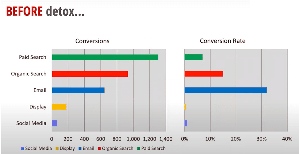
This is a default template that you can create. It illustrates why using presets isn’t always the best idea.
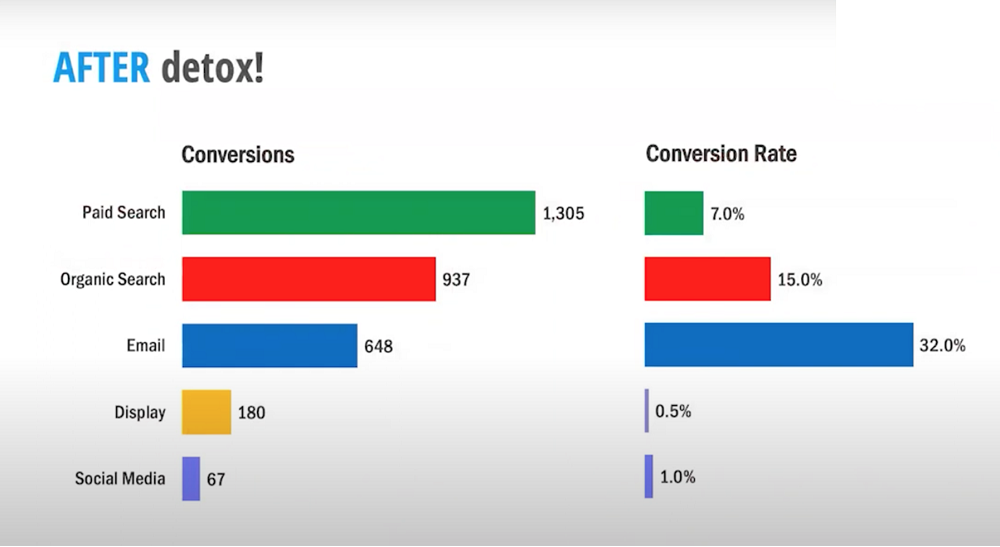
With just a few simple steps we can clean up barriers that prevent us from seeing information easily. The following steps have been taken to clean up the graph:
- Background border, legend, gridlines, and axis have been removed.
- The bar width has been increased.
- Direct data has been labeled.
- The font has been changed.
But there’s one more step. The second graph is definitely easier on the eye. But there are still too many colors distracting from our storyline.
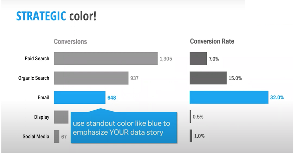
Notice how, in this image, strategic color has been used to emphasize your data story. Remember, the most important factor is your narrative. Your visualization should support this in every way. By using a standout color, you’re immediately drawing the audience to the most important information.
For those working with visual data, it’s invaluable to know how to pick colors effectively. Accurate color selection can make your visuals pop and provide clear insights to your audience. Use online resources like a *color picker* to find perfect HEX, RGB, HSL & CMYK codes and elevate the visual appeal of your presentations.
Bringing the story together
The client asked a question ‘what campaign channels generate the highest conversions?’ By looking at our data, we’ve found that paid search generates the majority of conversion volume.
However, to dig deeper and continue the story, we brought in the conversion rate. This changed the picture completely; email is our most effective converting channel.
But why did this happen? There were two potential conflicts:
- Our paid search conversion rate declined by 12% in Q3 (something we didn’t expect).
- Email click-to-open rate (57%) is well above target. But the open rate (3%) is falling below the target.
There’s a lot at stake here. If we do nothing, we could be losing an additional 10% conversion volume on the table ($250,000 loss).
Luckily, we have some solutions.
- We will review the least efficient areas of paid search campaigns to identify areas of improvement.
- We’ll further analyze email campaigns for the last 6 months to identify the most effective subject lines.
- Finally, we will evaluate our current email platform for testing capabilities.
And there you have it. A narrative for stakeholders that identifying problems and clear resolutions. How did we accomplish this? By sticking with the PICA protocol.
Summarising
You’re getting lots of fantastic insights from GA4. But without communicating how your data can bring actionable change, it won’t get you very far. That’s where clear storytelling and a strong narrative come into play.
We started this article by showing a headache-inducing graphic with different charts and images. With the PICA protocol, we offered a different approach. With storytelling, you can offer meaningful insights that communicate your message to audiences.
Just remember the key elements:
Purpose – Why are you including in your information?
Insight – What are the key observations of your data?
Context – Are you leaving your story at face value or digging deeper to find an interesting twist?
Aesthetics – How are you designing your charts to communicate and emphasize your message?
By following these simple steps you can ensure your insights are heard and seen.
Further reading
Want more? Check out our blog for tips on Google Analytics, as well as a whole host of other Google packages.
About Lea Pica
Lea helps data practitioners and leaders create and deliver powerful analytics and marketing data stories in PowerPoint (without putting their audience to sleep).
She is regarded as a leading data storytelling educator and workshop facilitator in the digital marketing + analytics field.

- Top 24 Google Analytics Chrome Extensions & Sheets Add-ons - 21/05/2026
- Best Consent Management Platforms (CMP) - 19/05/2026
- Google Signals and Consent Mode: What This GA4 Change Really Means - 23/04/2026