Top 10 Google Analytics Tips & Tricks to Help You Make & Save Money

People often feel that Google Analytics is for the digital world. It’s something for IT pros to worry about and doesn’t impact the business side of your business. It’s an easy trap to fall into.
After 18 years of working online, I can tell you there is a clear link between Google Analytics and your profit margins. Google Analytics can be an invaluable tool for improving a firm’s bottom line. Used well, it can help you to reduce costs and increase conversions and revenue. Moreover, with automation in place, Google Analytics can consistently provide you with actionable insights into your business that will achieve both those ends.
In this article, I’m going to share with you my top 10 Google Analytics tips for saving you money. They include reports you can generate to provide useful, actionable data storytelling. I’ll also show you how to access those reports and explain how and why they can save you money.
Please also check out my recent article on the top 39 Google Analytics tools.
Best & Worst Landing Pages
The landing pages report in Google Analytics is a good place to start. To find it, follow these simple steps:
- From the Analytics account overview, select the ‘Reports’ option on the sidebar
- Then choose the ‘Behavior’ option from the drop-down
- Click ‘Site Content’
- Finally, choose the ‘Landing Pages’ alternative from the next drop down
Having followed the above instructions, you’ll see the landing pages report similar to the one below. The table of data lists all of your site’s landing pages. It also provides a wealth of useful information about each of them.
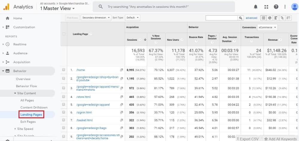
That information includes things like ‘sessions’, ‘bounce rate’ and ‘conversion rate’. These are invaluable when it comes to finding ways to increase revenue and reduce costs. Those figures, after all, let you keep track of the performance of your landing pages. The data also tells you which pages visitors land on.
Combined, this information provides you with insights on what is working well so you can apply those best practices to your other pages. Improve those conversion rates and you’ll see a corresponding jump in your profit margins.
Pages by Revenue Contribution
Analysing your site’s pages by revenue contribution is another of our handy Google Analytics tips. To view this report, you can follow the same pathway outlined above. That’s until you reach the ‘Site Content’ dropdown. You’ll then want to choose ‘All Pages’ rather than ‘Landing Pages’.
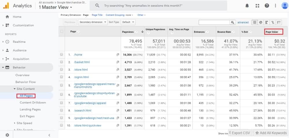
This report presents you with a lot of the same data you will find on Landing Pages. The most useful information for reducing costs or increasing revenue is that on ‘page value’. ‘Page value’ provides you with the average value of each page of your site.
The metric is designed to give you a snapshot of how much a page contributes to overall site revenue. For instance, imagine a page’s ‘page value’ is zero. That means it’s never been visited in a session which has resulted in a transaction on your site.
Viewing your pages by revenue contribution helps you assess the performance of different areas of your site. You can ID pages that aren’t pulling their weight. You can also better judge the ROI of marketing campaigns which funnel visitors through a particular page.
Best & Worst Internal Site Search
Most websites – and almost all e-commerce sites – have an internal search feature. That’s a search bar that visitors can use to find specific products or pages on particular topics. Google Analytics allows you to keep track of how visitors are using this feature. You can find the relevant report by following the steps outlined below:
- Select the ‘Behavior’ option from the Reports sidebar
- Then click ‘Site Search’
- Finally, click ‘Search Terms’ from the resulting dropdown
When you do this you will be presented with a table showing all of the terms searched for by visitors to your site. It will display how many unique searches there have been for each term, along with other handy information. They include things like ‘exit rate’ and ‘search refinement’.
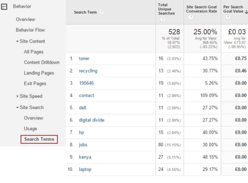
Knowing what terms visitors search for can be really handy. It shows you what your customers are interested in. It also suggests what’s possibly missing from or not easily found on your website.
‘Exit rate’ and ‘search refinement’ are two of the most important metrics on this page. If the percentage for either of these metrics is high it shows that visitors are either leaving your site or performing a new search after viewing initial search results. This implies that they haven’t found what they’re looking for from the first search.
You can use the insights you gain here to improve the user experience for visitors. For example, the queries can provide you with ideas for new content focused around the things your audience is interested in. Perhaps more importantly, these insights can be used to help improve the navigation on the site so that information people are consistently searching for is easier to access.
Broken Pages by Referral
Creating a report showing broken pages by referral is another way to use Google Analytics to help save money. The report is a little more difficult to generate than those covered previously. Follow the steps below to create this report:
- Select ‘Behavior’ from the Analytics sidebar
- Click ‘Site Content’ and then ‘All Pages’
- Click the ‘Pivot’ button at the top right of the table
- Select to pivot by ‘Source’
- Select ‘Page Title’ above the table of data
- Choose the ‘Advanced’ option at the top of the report
- Input ‘The page cannot be found’ next to ‘Containing’
Your report will now display the different referral sources that are directing traffic to broken pages on your site. The number of page views and entrances will be displayed for each referral source. To get more detail, you can then add ‘Referral Path’ as a secondary dimension to your table.
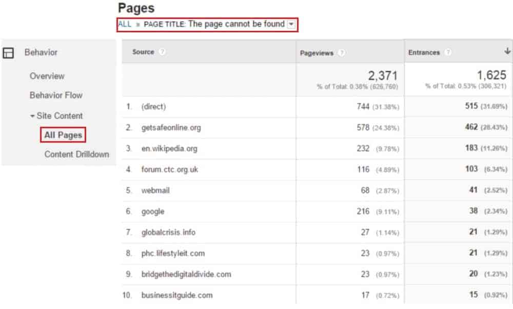
This data shows you where you have broken links and related problems that are diverting traffic to deleted or non-existent pages. If you find those links and fix them, you will provide a better user experience to site visitors. Making these improvements can also result in an uplift in traffic and a reduction in bounce rate.
Medium Pivoted by User Type With Metrics of Sessions & Conversion Rate
Pivot tables are a handy and underused tool available in Google Analytics. They let you take a unique view of data. This can aid in drawing specific conclusions. The following instructions will help you build a pivot table that you might find useful:
- Select the ‘Acquisition’ option from the sidebar
- Click ‘All Traffic’ and then ‘Source/Medium’ from the resulting drop-down menu
- Press the pivot button at the top right of the table (as demonstrated in the image below)
- Select ‘Pivot By’ immediately above the table and choose ‘User Type’
- Set the ‘Pivot Metrics’ to ‘Sessions’ and ‘Goal Conversion Rate’
Your report will display data related to the traffic sources and the medium. For example, if the source was Google the medium would be Organic Search. This pivot table also shows you the number of sessions and the conversion rate related to each traffic source.
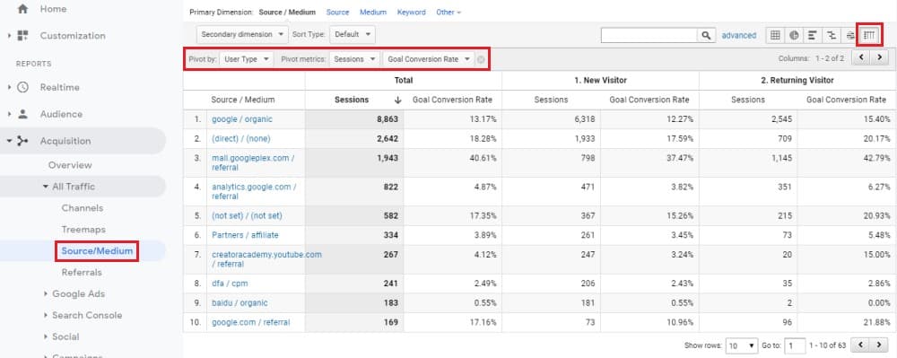
The data in this pivot table is also partitioned by if the traffic was a ‘New’ or ‘Returning’ visitor. That’s because we chose to pivot by ‘User Type’. This report enables you to analyse how new and returning visitors act on your site. From this, you can see which traffic sources deliver more new or more repeat visitors. You can also determine where your highest converting traffic in each category comes from.
Channel Pivoted by User Type With Metrics of Sessions & Conversion Rate
Channel Pivoted by user type is another type of pivot table. To generate it, follow all but one of the earlier instructions. The only difference is that you need to choose ‘Channels’ from the ‘All Traffic’ drop down, rather than ‘Source/Medium’.
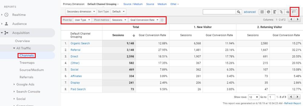
The data and insights you will receive are similar in a lot of ways to the previous pivot table. However, metrics are now displayed for marketing channels and not by source and medium. The important thing to note here is the difference between a channel and a source according to Google Analytics.
A channel, as per Analytics, is a grouping of several traffic sources from the same medium. For instance, Google Analytics refer to ‘Organic Search’ as a channel. That channel would include sources such as Google, Bing, and Yahoo. All of those sources would be classed as coming from the same medium ‘Organic’.
This pivot table provides you with clear insights regarding how your audience acts, and what is the most valuable audience, by the medium. You can use this information to develop your digital marketing strategy.
Intelligence Insights
It’s important to keep a close watch on your Google Analytics accounts. Many site owners and professionals simply don’t have hours to spend poring over Analytics data. That’s where Intelligence Insights can help.
Intelligence Insights are insights into what you data means, generated by Google Analytics. They explain trends, changes, and opportunities that can impact your business. That might be an increase or decrease in average revenue, conversion rate or other factors. You can view Intelligence Insights by clicking the ‘Insights’ button found at the top right of a report.
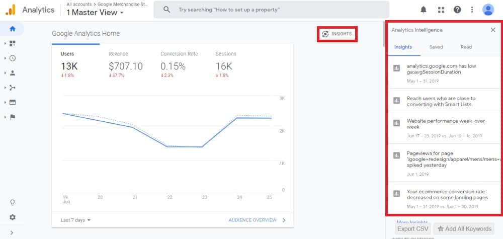
Clicking the button opens a drop down list of the current insights generated by Google Analytics. Selecting any of the insights on the list will give you a more detailed breakdown of the data it’s drawn from. You can then assess and act upon this information to improve your site’s performance.
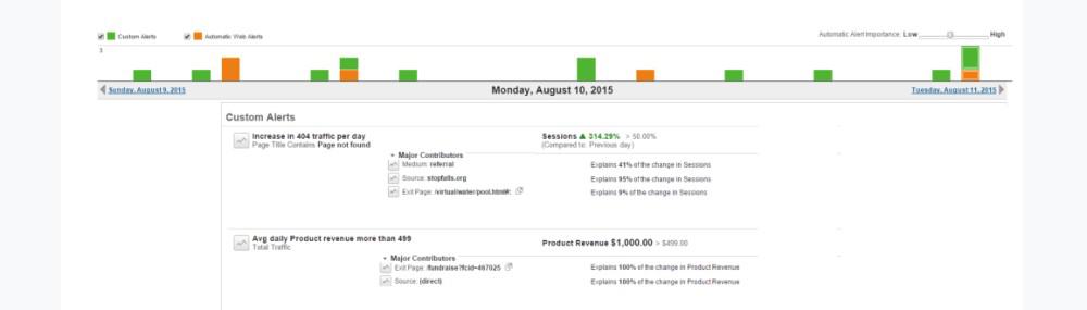
Custom Alerts
You can also choose to set Custom Alerts in Google Analytics. These are similar to Intelligence Insights, except that they are created and managed by you. You can choose your custom alerts to be triggered when specific things occur. For instance, the image below shows two examples of Custom Alerts. One is an alert to show that there has been a daily increase in 404 traffic to a site. The other has been created to report when average daily revenue for a site exceeds $499.
Setting up Custom Alerts is very straightforward. All you need do is follow these simple steps:
- Click the ‘Customization’ tab on the sidebar
- Select ‘Custom Alerts’ from the drop down
- Choose ‘Manage Custom Alerts’
- Press the red ‘New Alert’ button
- Input a name for the alert and then set the conditions you wish the alert to apply to
- Click ‘Save Alert’
Custom alerts are a useful way of gaining insights when things you’re interested in, either positive or negative, are occurring on your website.
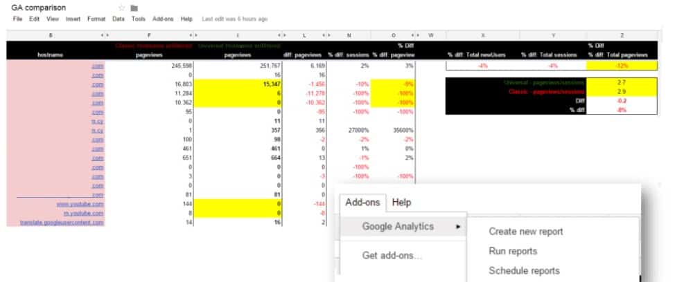
Google Sheets – Automatic Reporting
You may already know that Google Sheets has a very useful Google Analytics Add-on. It lets you create, manage and compare custom reports via an easy and more familiar interface. Getting the Analytics add-on for Google Sheets couldn’t be simpler:
- Open up Google Sheets
- Select the ‘Add-ons’ option from the header bar
- Click ‘Get Add-ons’ on the drop down
- Type ‘Google Analytics’ into the search bar on the subsequent window
- Select the add-on and follow on-screen instructions to install it
The add-on can do more than just help you better organise your Analytics data. You can also use it to save time by automating the generation of Analytics reports. That’s possible thanks to the ability to set an auto-run for your reports.
The auto-run will generate Analytics reports in Google Sheets based on the most up-to-date data, as and when you desire. You can set it by following these steps:
- Select ‘Add-ons’ from the header bar
- Click on ‘Google Analytics’, which will appear once you’ve installed the add-on
- Check the ‘enable reports to run automatically’ box
- Set the time and frequency at which you want the report to run
Google Analytics Reports will provide you with a clear overview of what is happening on your website. You can run these reports as regularly as every hour if you wish to, but unless you are dealing with a site that has millions of visitors you’re probably better off running these reports once a week, once a fortnight, or once a month.
Small Business Owner Dashboard
There are plenty of resources out there designed to help you save money using Google Analytics. An easy way to find these is by heading to the Google Analytics Solutions Gallery. A good initial dashboard to setup is the ‘Small Business Owner Dashboard’.
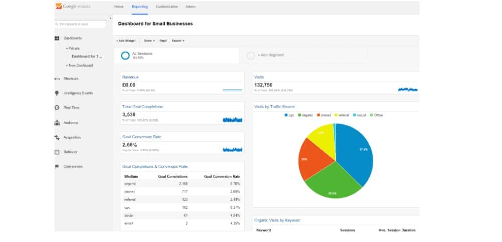
This dashboard is designed for small e-commerce businesses. It prioritises and displays reports and data that can help you save money or increase revenue. As its own description states, it takes a ‘bottom line approach to a dashboard’.
Using the dashboard makes it provides you with a host of Google Analytics data at your fingertips. The information is provided in a way that makes it easier for you to get insights into your business. You can then develop a marketing strategy that benefits your bottom line.
- Top 24 Google Analytics Chrome Extensions & Sheets Add-ons - 21/05/2026
- Best Consent Management Platforms (CMP) - 19/05/2026
- Google Signals and Consent Mode: What This GA4 Change Really Means - 23/04/2026