User Journey Visualisations With GA4 Data | GA4 Guide

As we all know, Google Analytics 4 data has many interesting and exciting capabilities. One of the best aspects is how it can be used to present information in a way that supports data storytelling. Today we’ll be looking at user journey visualisation with GA4.
We’ll look at examples of two types of visualisations, and explain how you can export data from GA4. We will also explore how you can unnest data for Looker Studio, and look at some use cases for larger data sets.
So, let’s get started!
This is a write-up of the talk given by Ralph Spandl at GA4ward MKIII. You can find his slides here, and the recording is below:
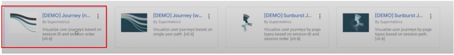
Two user journey visualisations
Today, we’re going to talk about two types of data visualisations.
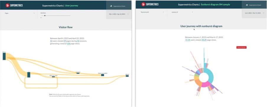
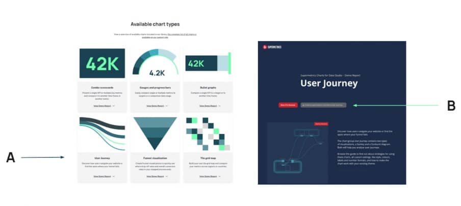
Firstly, we’ll be looking at the Sankey diagram (shown on the left in the image above). This shows an aggregated view of visitor flows. Secondly, we’ll be looking at a sunburst diagram (shown on the right), which allows us to see page sequences.
These forms of visualisation have many use cases. This ranges from user journey mapping to visualizing a data driven attribution model.
Want access to these templates? Follow this link!
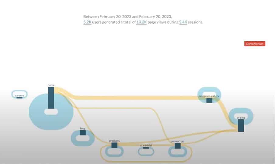
Sankey diagram
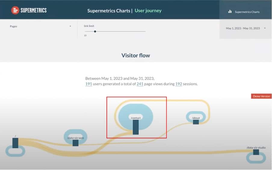
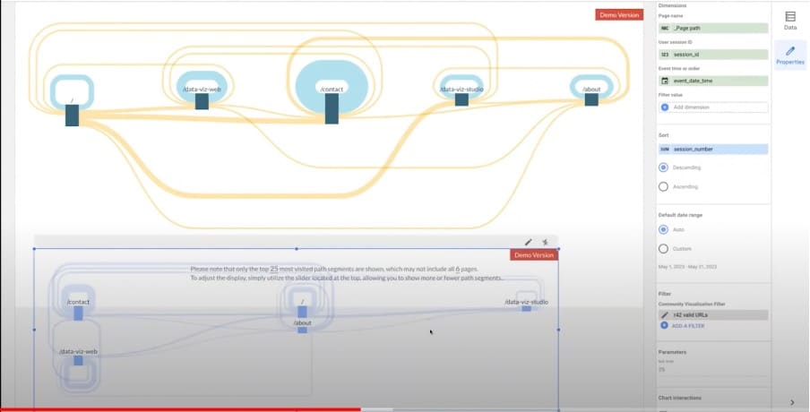
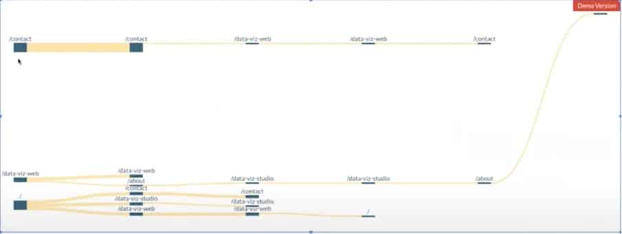
The above image shows a visualisation in Looker Studio, displaying GA4 data from the R32 website. As you can see, GA4 has automatically created a Sankey diagram for us. By clicking different aspects of the diagram, we can see a map of the customer journey. It’s a great tool for conversion tracking (especially when used in conjunction with CRO tools).
For example, Looking at the contact page, you can see the people are going in circles.
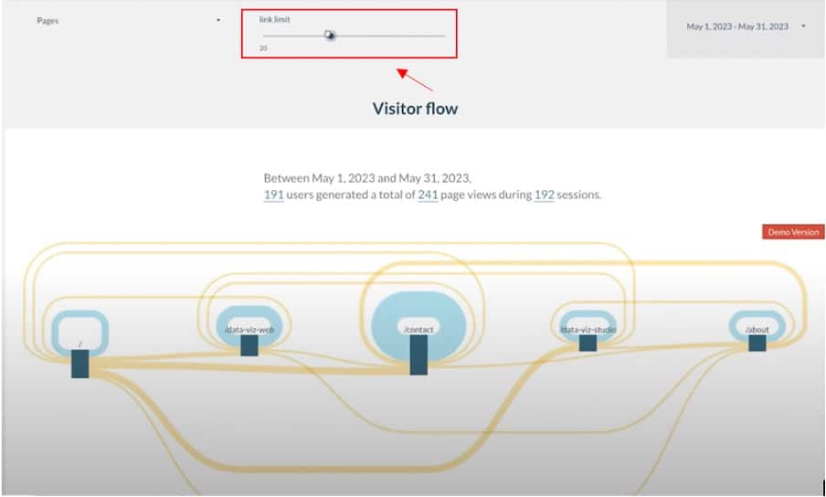
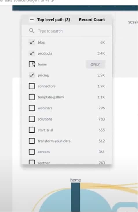
If you have a lot of pages, your diagram can quickly get out of control. Luckily, Looker Studio has a handy feature called link limit. This reduces (or increases) the number of journeys you can view.
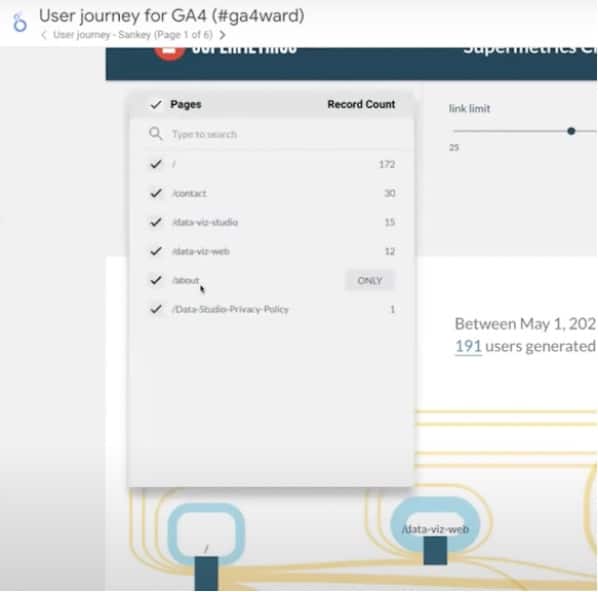
You can also remove specific pages from your diagram.
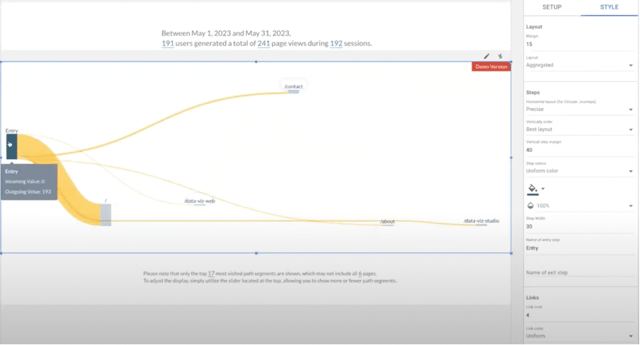
Now let’s look at a very small sample. We’re only looking at three pages.
Sunburst diagram
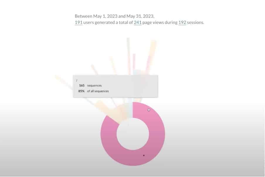
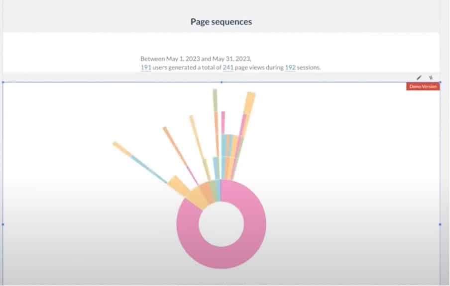
Ten years ago, data analyst Kerry Rodden used a sunburst diagram to look at YouTube data. She classified one month of data into six categories of user behaviour after visiting the home page. From the above image, we can see that 85% of all sequences started on the home page.
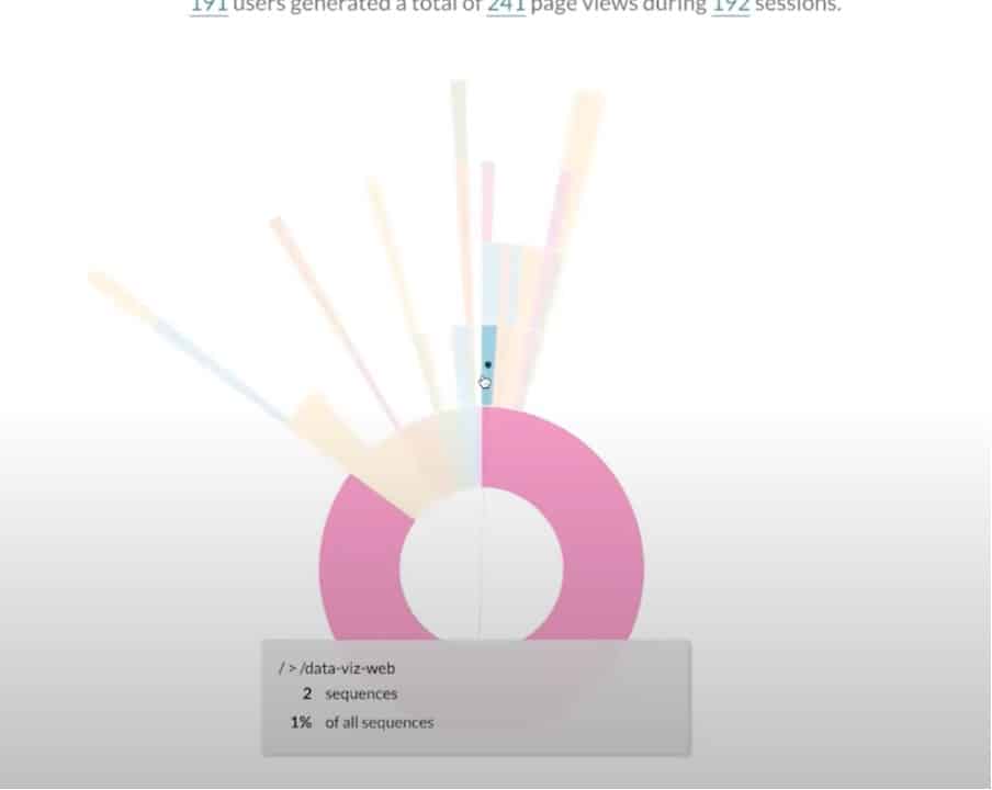
We can now look at a second path – from here we can see that 1% of all sequences started from the data viz path. By looking at individual paths, we can start to understand how people moved through our website.
For smaller websites, it’s fine to look at smaller pages. In the case of bigger websites, it’s a good idea to merge pages into bigger sections. Suppose, you might create an overall section for products. You can see whether people stay within these sections or navigate to other areas. We’ll look at this in more detail later.
Data Requirements
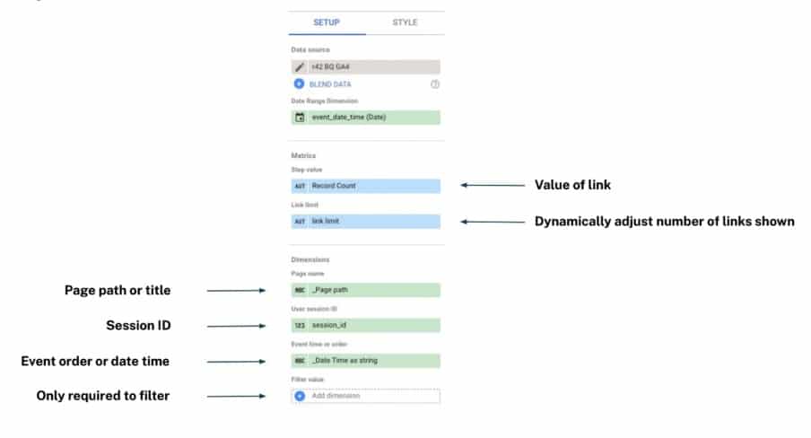
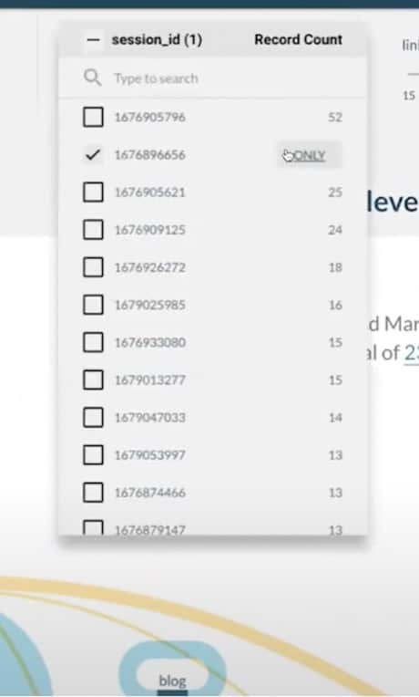
Above, is the setup for a community visualisation. To create this visual, there are several requirements. We need to create dimensions, these are:
- A page path or title.
- A session ID.
- The event order or date and time.
We also need to create a set of parameters, including:
- The value of the link – we have used record count.
- A link limit – giving users the power to decide the number of links shown in a visualisation.
These are the dimensions and the metrics that we need. But how do we get them out of GA4? Let’s find out.
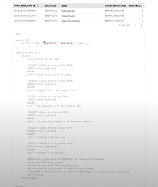
How to export your data from GA4
Getting data into BigQuery
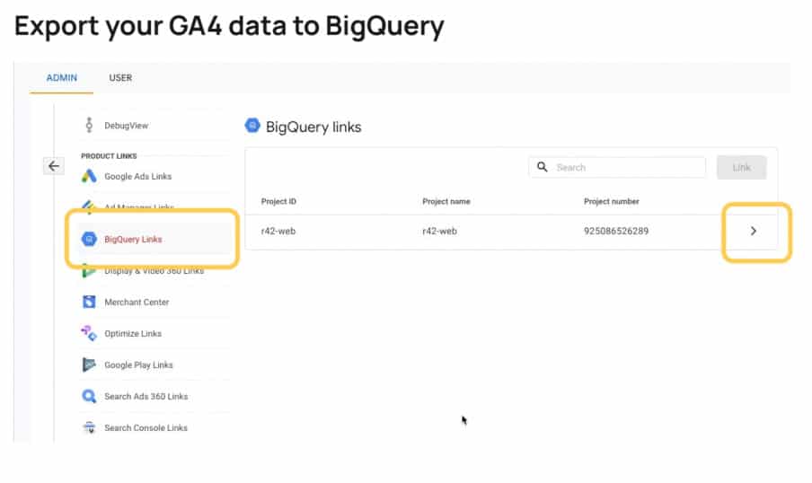
There’s a good chance you have already linked with BigQuery. If you haven’t, you should! The process isn’t complicated and there are GA support articles to help you. It only takes 24 hours for your data to get to BigQuery, and then you can start working.
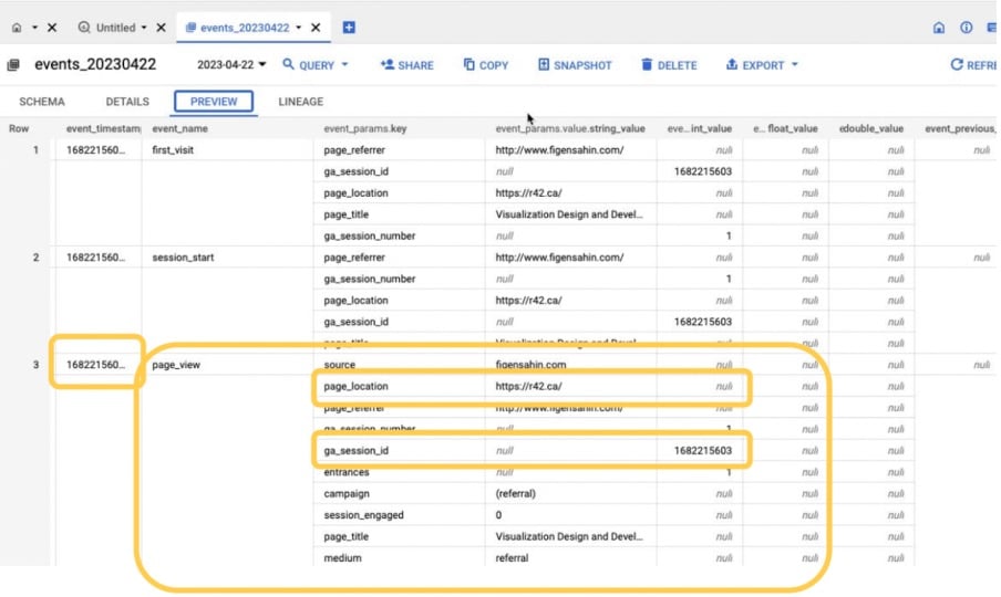
Once you’re in BigQuery, you’ll be met with a nested page view similar to the one shown in the image above. If you look a bit closer, you’ll find everything that you need. You’ve got a time stamp, a page location, and a session ID. But now that you’ve got this nested data, you need to move it into Looker Studio.
Getting data into Looker Studio
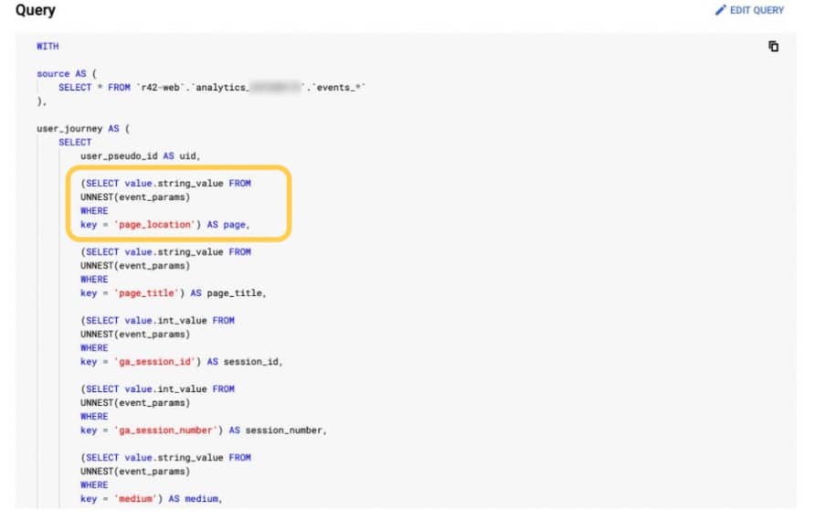
To make the work as easy as possible, we’ve created an SQL query that unnests the data.
Method #1 – Create a view
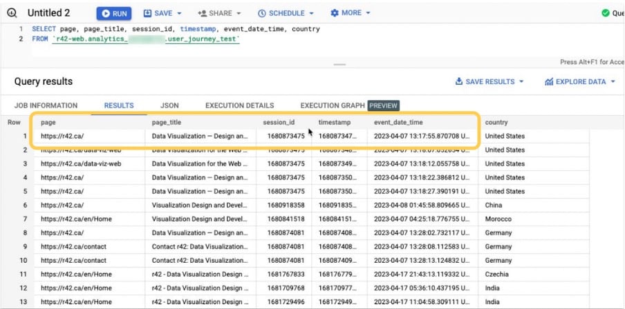
We’ve now taken this SQL query and pasted it into BigQuery. From here, we created a view that can be used in Looker Studio. Each time you load your report it will execute a query; be warned if you have a huge website, this might become costly.
Method #2 – Insert query directly into Looker Studio
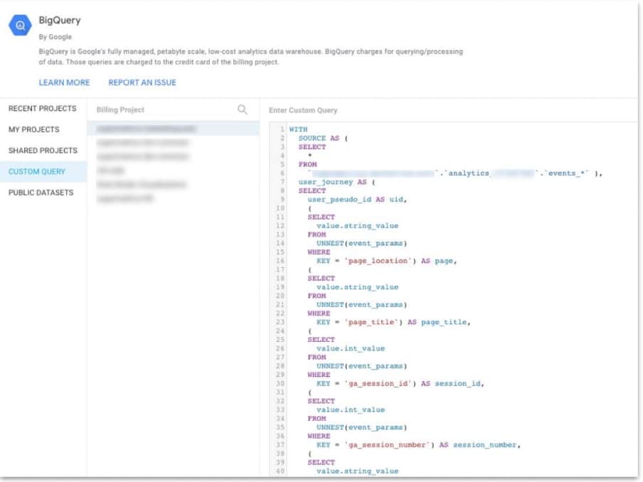
Your second option is to directly import your query into Looker Studio. To do so, simply head to the BigQuery connector>Custom Queries. Next, choose your building project and paste in your query.
Remember, don’t apply these techniques to large data sets.
Hint: If you want to do this right, you will need to create materialized views or use something like dbt.
Method #3 – Unnesting data – www.ga4sql.com
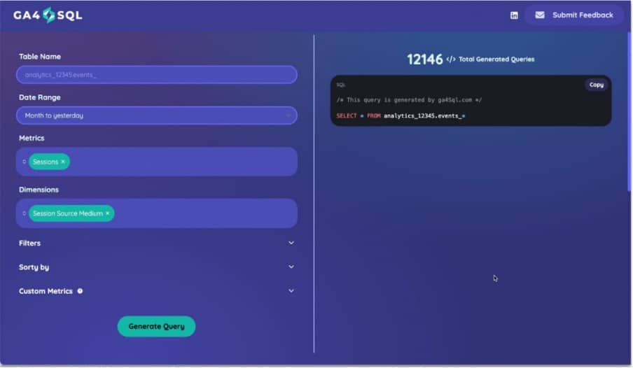
Ga4sql.com is a website that can process SQL queries and unnest data. You can view this video to see exactly how it works. It’s a useful way of getting data into Looker Studio.
Of course, now we have our data we also need a chart for mapping the customer journey.
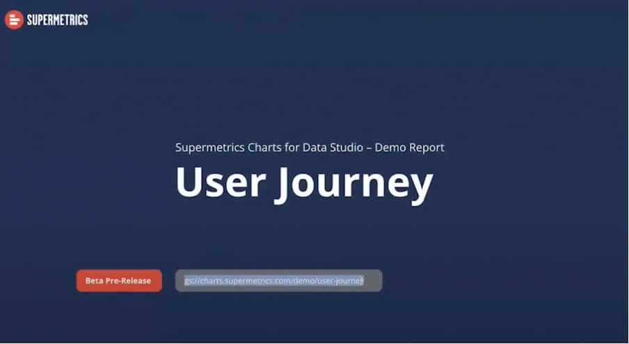
Supermetrics Charts: User journey demo version
Supermetrics Charts is a commercial library, but you can use the demo version free of charge. The demo is fully functional and can be used for as long as you want.
There are guides to show how everything works and explain the different data models.
There are also pages that explain the styling, configurations, and layouts that you can use.
Head over to the Supermetrics Charts home page to learn more about the demo.
Building charts with Supermetrics
Sankey diagram
From your Supermetrics demo account, copy the manifest path.
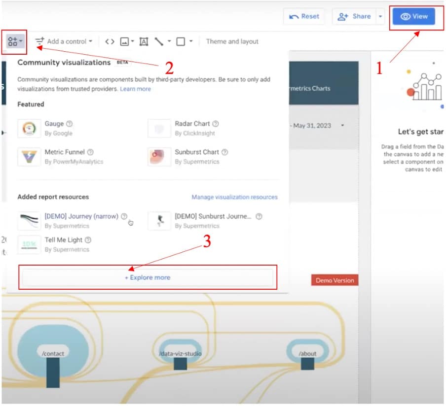
Now, it’s time to head back into Looker Studio. From here, let’s go to edit> community visualisations> explore more.
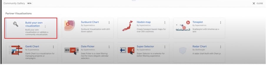
From the following menu, choose to build your own visualisation.
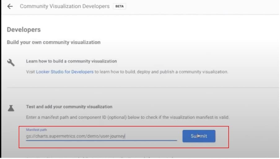
Now, paste the manifest path into the box at the bottom of your screen.
Next, we are presented with a series of options. Choose the first option from the list.
We can now drag the chart onto the page. Next, we need to input the correct fields. These are shown below.
- Date range dimension – event_date_time
- Page name – _page path
- User session ID – session_id
- Event time or order – event_date_time
- Link limit – link limit
We’ll also add a filter to ensure correct links in the dataset ‘+42 valid IDs’.
Additional settings
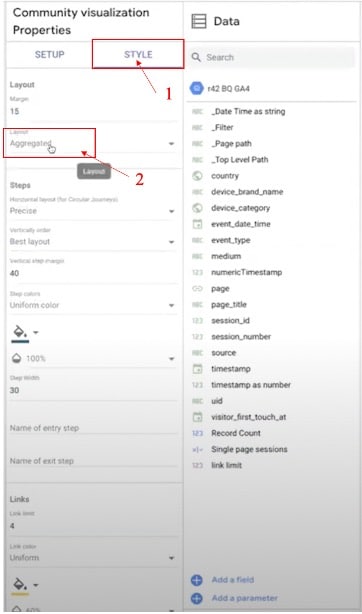
Let’s look at a couple of settings in the style panel that might be of use to you. Firstly, let’s look at the layout panel.
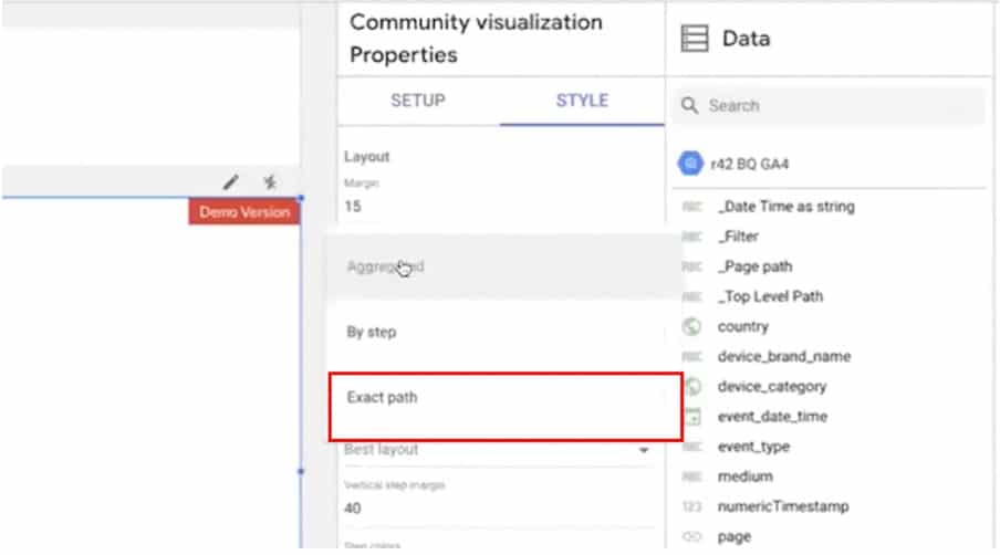
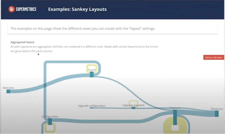
Clicking this option will reveal three different layout options. Let’s choose ‘exact path’.
This produces a result similar to what we saw in the sunburst diagram; a clear roadmap of the customer journey, helping you to track user interactions. This is useful when you have data sets that you want to view in an exact row.
You might want to know which pages users are accessing your site through. Right now, we don’t have this information from our visualisation. To find out, we can create a virtual page that shows how people are landing on individual pages.
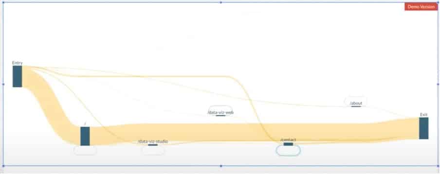
What about people leaving your site? Which pages are the most widely used exit routes? Again, we can create an exit page to find this information.
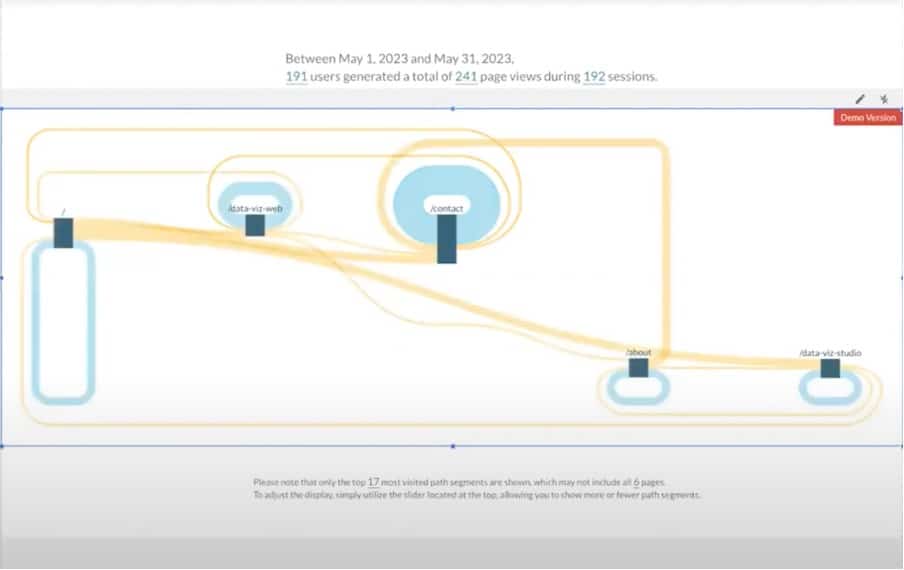
It’s also important to keep an eye out for self-links. These are the blue areas of the visualisation that denote where a user has been and followed links to pages they are currently on. Notice the big blue area at the centre of the above image where users have looped from contact to contact.
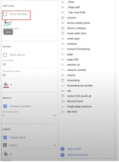
Self-links can be easily removed if you don’t want to see them. Simply click the box shown above.
Sunburst diagram
Above is an image of a Sunburst diagram mirroring the effect path view of our Sankey diagram.
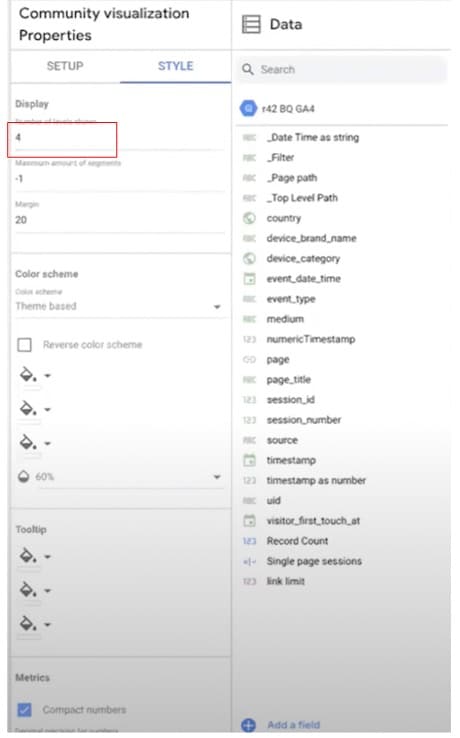
One of the best features of this visualisation is that we can show the number of levels we want to show. To expand our graph, all we need to do is change the number in the ‘Display’ section.
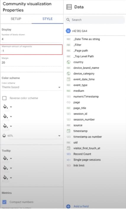
What if you want to control the number of segments shown on your user journey visualisation? After all, if you have a big website, your visuals can become a little confusing. Thankfully, changing the number of segments is equally easy. Head to ‘Maximum amount of segments’ below ‘Number of levels shown’.
SQL Code
On page four of the Supermetrics demo, you’ll find code that you can copy and paste into your connector. Just make sure you don’t forget to change the project and dataset.

The same applies to the GA4 SQL query on page 5. Again, remember to change the project and dataset.
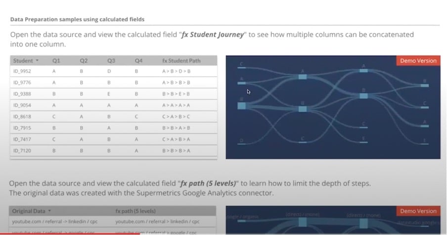
Calculated fields
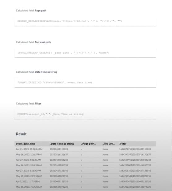
The last page contains all the calculated fields we have been using. This might come in useful, for example, if you’re only working on the top-level path of your website.
Working with large data sets
We promised we would look at an example of a large data set. This is a subset of a couple of days of data on the Supermetrics website. This is showing only top-level data
As before, we can choose to focus on only a couple of pages. This might be helpful if you’re looking into a funnel to improve user experience.
Not only that, but we can also filter by individual sessions. This can help in a number of ways. You can spot where users are getting stuck. Or, you can compare sessions by country. This is useful when building a marketing measurement framework and seeing if there are any differences between campaigns.
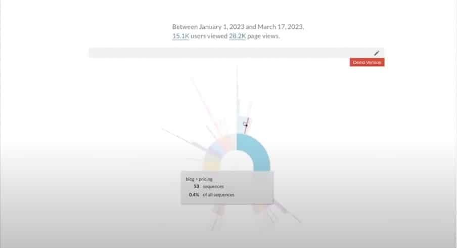
This journey can also be used as a filter in a sunburst diagram. By clicking individual sections you can learn more about the customer journey. For instance, you might see that someone went from blog to pricing. You can then apply this as a filter to your visualisation.
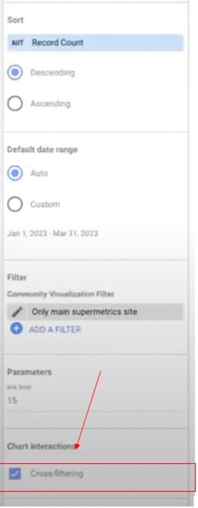
To add cross-filtering, simply scroll down from the setup panel and choose ‘Cross-filtering’. You should also set the ‘Filter value’ as ‘_filter’.
Note: In Looker Studio, you cannot filter on two dimensions. Instead, you need to create a calculated field where you put the two values together. This might be useful if you have a chart on the side. You can click on a segment and view more in-depth information.
Conclusion
By now you should have a better idea of the usefulness of user journey visualisation with GA4. After the announcement of the google optimize sunset, we’ve all had to find new ways to enhance our websites. A tool like Looker Studio can help you to dig deep into user journeys and make improvements.
Of course, to understand your data, you also need the best graphs. Supermetrics can enhance the existing visualisation capabilities of Looker Studio. And remember, the demo is available now for free.
About Ralph Spandl
After finishing his studies at the University of Fine Arts Berlin, Ralph moved to Montreal, where he founded a few years later r42, which eventually became a web agency with a portfolio of companies working in the financial, industrial, and leisure sectors and a few non-profit organizations.
For years Ralph has had a soft spot for data visualization, which he eventually centres his professional career around. Since 2018 or thereabouts, he has been doing just that: designing and coding data visualizations.

- Top 24 Google Analytics Chrome Extensions & Sheets Add-ons - 21/05/2026
- Best Consent Management Platforms (CMP) - 19/05/2026
- Google Signals and Consent Mode: What This GA4 Change Really Means - 23/04/2026