A Beginner’s Guide to Google Analytics Dashboards

You’ve learned all about how Google Analytics can help you manage your site. You’ve signed up to the service and connected it to your website. You’re now ready to start viewing and analyzing the tracking data Google Analytics provides. To do this you need to learn how to navigate the platform. This is where Google Analytics dashboards come in.
The main interface of Google Analytics is called the dashboard. That’s a good way to think about it. It’s in many ways like a car’s dashboard. It includes lots of different displays, features, and buttons to press. It’s through the dashboard that you can get to the reports Analytics creates from your data.
In this guide, you will learn how to navigate Google Analytics dashboards. By the end of this, you will have an overview of what information you can access through the dashboard and what these dashboards reveal.
Previous articles in the Google Analytics Guide:
- An Introduction to Google Analytics (GA3) Universal Analytics
- How to Set up Google Analytics on Your Site the Right Way
The Analytics Home Page
When you log in to Analytics, the first thing you’ll see is the home page. It’s a kind of base of operations from which to start on your journey with Analytics. It displays a selection of interesting insights into your data. As well as providing all the options for navigating through your account.
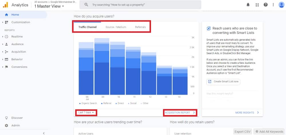
You can access the different data on the main part of the homepage through what Google calls ‘cards’. These are panels displaying graphs, tables, or other snapshots of your data. The title for the card is often in the form of a question. I.e. ‘How do you acquire users?’. Insights you can use to answer these questions are then provided in the data.
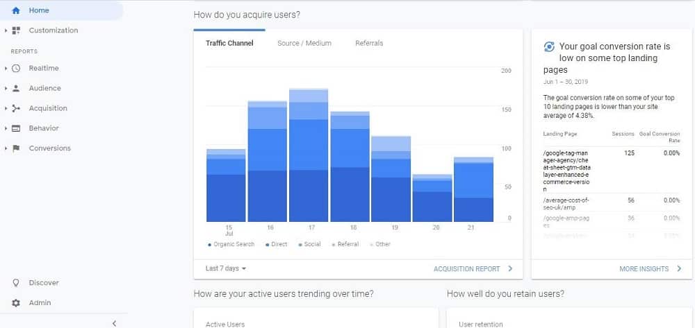
You can alter what the homepage cards display by using the ‘card controls’. Every card – apart from the real-time card – lets you choose the time period for which it displays data. You can adjust the time period from the drop-down menu at the bottom of the card.
Many cards also let you alter the dimensions and metrics they show, via options across the top of the card. As mentioned in our introduction to Google Analytics, Dimensions are information about a user. This includes things like what city they come from or what device they are accessing your site on. Metrics are the numbers. For example, the number of visitors your website is getting.
Most cards will include a link to the full report from which the data is derived. Clicking that link will take you straight to the report.
The other way to reach individual reports is by clicking the five tabs down the left-hand side of the dashboard. These tabs are titled ‘Realtime’, ‘Audience’, ‘Acquisition’, ‘Behavior’ and ‘Conversions’. Let’s take a look at each of them in turn.
Realtime Google Analytics Dashboards
The first tab on the menu contains the ‘Realtime’ Google Analytics dashboards. When you click ‘Realtime’ on your dashboard, you’ll go first to the Realtime overview page.
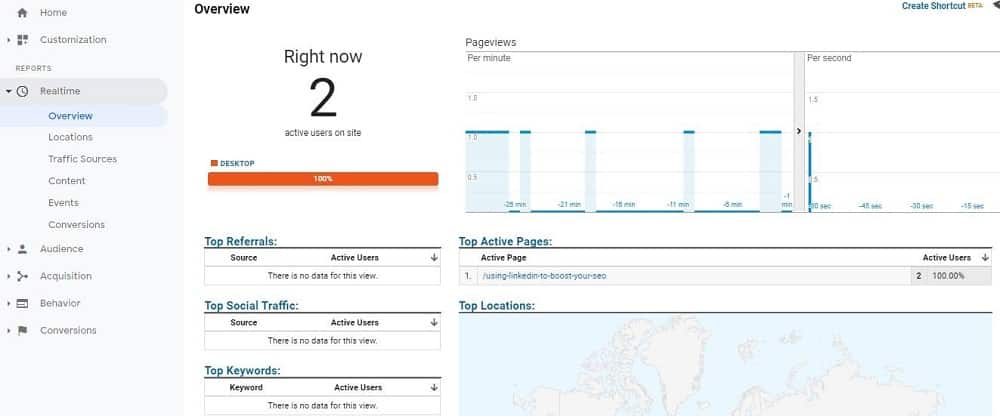
The realtime tab provides live data concerning visitors who are active on your site right now. The data updates continuously. You can see hits that Analytics receives within seconds of them happening. The Realtime tab provides information about users active on your site.
Realtime data shows you how many people are on your site. It reveals which devices they’re using to visit. It also shows which pages they’re viewing and even where they came to your site from.
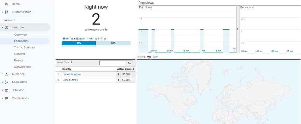
The overview page gives you those insights in brief. You can also get more detail about particular aspects of your Realtime data. For that, you can click one of the options listed below ‘Overview’. That’s on the left-hand side of the page. The above is an example of what you’d see if you chose to view ‘Locations’ data in more detail.
Realtime is a useful tab for sites that have a lot of traffic. If you don’t have many visitors to your site, then most of the time you will have between 0-5 active users.
Audience Google Analytics Dashboards
The audience Google Analytics dashboards are where you can find reports regarding the characteristics of your site’s users. The overview page provides you with a broad range of data.
The main graph on the page shows how the number of users of your site changes over time. You can choose whether it shows changes by the hour, day, week, or month. This information provides different insights. For example, if you analyzed engagement by hour you could identify the best time to be active on social media.
The day, week, and month options provide insights on historical trends. For example, you can see if your traffic has increased or decreased over time. You can set a custom time period to analyze as well. You can do this by clicking on the date range in the top right corner. This is a feature present in almost all of the tabs.
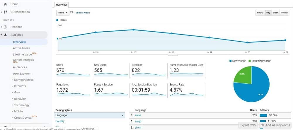
On the Audience tab, you can see a selection of related graphs with individual headings. By clicking on a graph you can access additional information regarding that metric. Below is an overview of each of these metrics and why they are important:
Users
The total number of people who have visited your site within a time range. Returning visitors are included in this count.
New Users
This is the number of people who visited your site for the first time. If the proportion of return users relative to new users is very low then you might need to improve your site content.
Sessions
This is the total number of times that people visited your website. For example, a returning user might visit your site on five separate occasions. Each occasion is a session.
Number Of Sessions Per User
This is the number of times on average a person returned to your site.
Pageviews
The total number of pages on a site that were visited during a certain timeframe.
Pages/ Session
How many pages on average a user visited per session. The higher the number the better the more engaged the user. If you have a very low number of pages per session you might need to improve your content or make it easier for people to access content on your site.
Average Session Duration
This is the amount of time on average a person spent on your site during a visit. You want this number to be quite high. If it is less than 1 minute consider reviewing and improving the content on your site.
Bounce Rate
Although not in Google Analytics 4, Google Analytics 3 (universal analytics) users will still be able to see this. This is the percentage of people who left your site after visiting only one page. You want this number to be small. If it is really high then you haven’t provided your visitors a reason to stick around.
As well as how many users you have, the Audience tab lets you find out things about your audience. You can view reports related to their demographics (language, country, etc.). Also, you can view things like the devices, what type of mobile phone, for example, site visitors use.
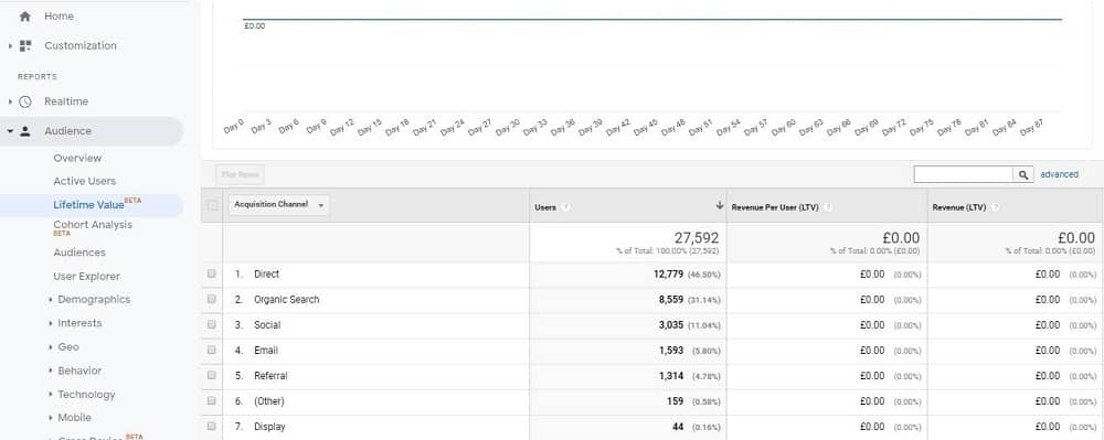
You can access more in-depth information through the Audience tab. The ‘Lifetime Value’ section is a good example. It reports on the value users bring to your business over time and multiple sessions. This can help you know where to allocate your marketing budget, saving you money.
Acquisition Google Analytics Dashboards
Acquisition Google Analytics dashboards provide information about how users find your site. The graph and pie chart reveal which channels bring the most traffic. The main traffic channels are Organic Search, Referral, Direct, Social and Affiliate.
Organic Search
This is traffic from Google, Yahoo, or similar.
Referral
Visitors from a third party website that has linked to your content.
Direct
Site visitors who typed your URL into their browser to visit you directly.
Social
Traffic from a social media platform like Facebook or Instagram
Affiliate
Traffic that has an affiliate identification code attached to it. This is only relevant for e-commerce stores
The screenshot below shows the report that you see when you press on the Acquisition tab.
Below the graphs and pie chart, there are tables where you can see how visitors from different channels compare against each other across a range of metrics. This is useful information to analyze as it provides insights about where your most engaged visitors come from.
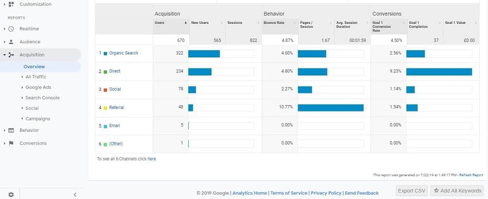
If you click on a channel you get a breakdown of the different referral sites. For example, if you pressed on the organic search you would see what search engines send you traffic and how much traffic each search engine provides.
The other options on the Acquisition tab relate to things like Google Ads and Search Console. You need to link these tools up to Analytics for these sections to be useful.
Behavior Google Analytics Dashboards
The Behavior tab is where you’ll find reports about the actions visitors take when they’re on your site. By default, this covers things like which pages they visited, how many individuals visited the different pages, average time on page, bounce rate and percentage exit.
Percentage Exit is the ratio of people who left your site from a page as against the total pageviews. This is different from the bounce rate.
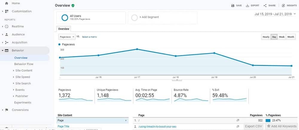
By default, the Overview page focuses primarily on pageviews. It gives you some basic insights into how many pageviews each of the pages on your site gets.
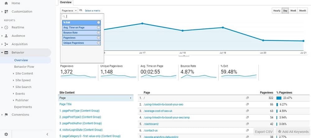
The dropdown menu at the top of the page lets you change the dimension shown on the main graph. You can also click on one of the smaller graphs to get a comprehensive overview of this information.
You can access information regarding behavior for each page on your website. These reports provide you with information on what pages need to be improved. For example, if a page had a very low ‘Avg. Time on Page’ and a high ‘Bounce Rate’ it shows that visitors didn’t find the content useful.
The further sections within the Behavior tab allow you to drill down into the various reports. It’s within these sections that you can get specific insights such as how many visitors download a PDF that you offer. These types of insights are great for improving customer experience on your site. By understanding how visitors currently use your site, you get a stronger idea of the improvements you can make. You can combine this data with the CRM data to build a solid sales pipeline.
Conversions Google Analytics Dashboards
As a website owner, you probably have an end goal for your visitors in mind. For example, if you were running an e-commerce store then trying to sell products online. Alternatively, if you run a services company you might want your website visitors to fill in an inquiry form or sign up to a newsletter.
The percentage of site visitors who complete these goals can be measured through the conversions google analytics dashboards. By default, you will not see anything on this tab unless you set up goals.
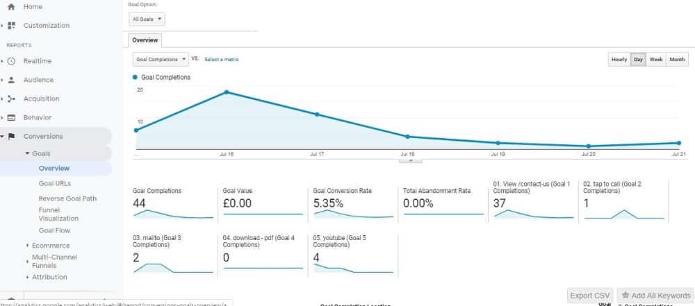
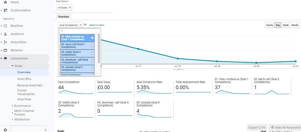
Once you have set up your goals, though, you will see something similar to the reports shown above and below. Goals reports are diverse and varied, as they are based on your own targets.
With goals set up, you can view reports based on the URLs. You can track the pages users visited on their way to fulfilling a goal. On the flip side, you can also look at the rate at which users abandon your goals.
Other elements of the Conversions tab include ‘Ecommerce’ and ‘Multi-Channel Funnels’. If you’re just getting started with Analytics, you may not want to worry about these.
Ecommerce provides a more retail-focused way of assessing how visitors use your site. The insights the area offers can help inform loads of business departments, from your inventory management system to customer service. Multi-Channel Funnels provide you with information on how different marketing channels feed into conversions.
Conclusion
The above is a whistle-stop tour of the basics of Google Analytics dashboards. It should provide you with a fair idea of the kinds of reports you can check out and where to find them. The Analytics dashboard can seem complex at first glance. When you really get down to it, it’s very user-friendly.
Each of the tabs has an overview page that’s a great place to start when looking to draw insights from your data. To find out more in each area, you can also explore the more focussed sections also included in each. But if you really want to visualize your data in a customisable way, then you can start to look at Google Data Studio.
- Top 24 Google Analytics Chrome Extensions & Sheets Add-ons - 21/05/2026
- Best Consent Management Platforms (CMP) - 19/05/2026
- Google Signals and Consent Mode: What This GA4 Change Really Means - 23/04/2026